Widget Use
Displays articles in list format, allowing for a list title and icon, as well as other configuration options.
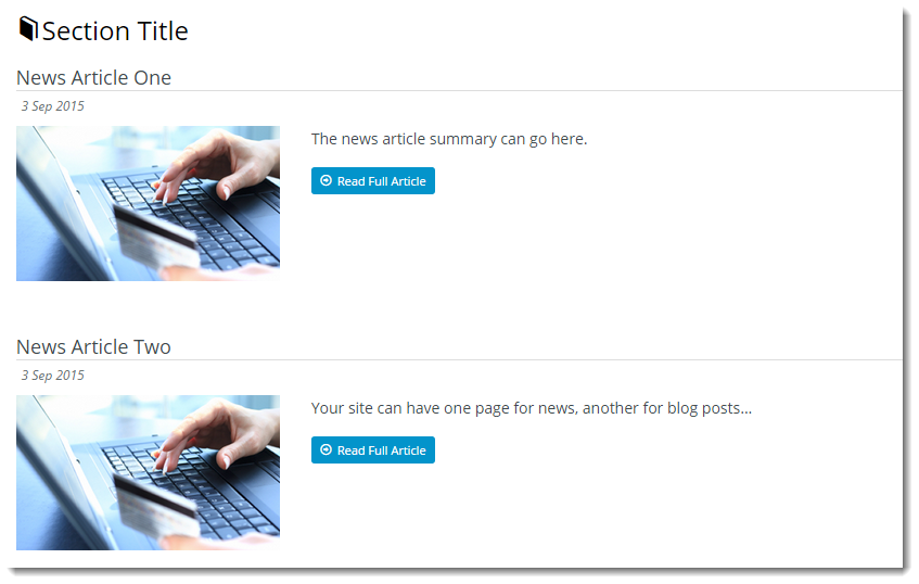
Example of Widget Use
Following is an example of the widget in use:
Where can the Widget be placed?
The widget can be used in the following templates:
- Article List Page Template
Widget Options
| Option | Use | Comments | Available from Version |
|---|---|---|---|
| Description | A short description of the widget's use. | We recommended this field be updated so the widget's purpose is clear at a glance from the template page. | All |
| Layer | The layer the widget is valid for. | The layering technology allows for the content to be shown to specific audiences. This is handy if the content is only valid for a certain type of user, or if the same widget is required for more than one audience, but different configuration is needed. The widget can be added to the zone more than once and the layer feature can determine which audience can see each widget. | All |
| List Title | The heading text displayed at the top of the article list. | All | |
| Title Icon | The icon displayed to the left of the List Title. | Select via drop-down | All |
| Max Number Of Articles | The maximum number of articles to display in the article list. | Default is: 5 | All |
| Article Type Filter | The article 'type' from which the list items are drawn (each article is assigned a 'type' on creation; the drop-down list will be populated with all available Article Types on your site). | Select via drop-down | All |
| Order By Field | Determines which article field is used to order the articles in the list. | Default is: Posted Date | All |
| Order By Direction | Determines which direction the articles are ordered by - ascending or descending. | Default is: Descending | All |
| Image Position | Determines the side that the image will be displayed on. This option will also move the summary and the 'Read Full Article' button to the far left in place of where the image is by default. | Default is: Left | All |
| Show Read Article Button | Determines whether the 'Read Full Article' button is displayed for each article. (The user can navigate to the full article page if this option is unticked by clicking on the article title.) | Default is: ticked Untick to disable | All |
| Article Route Prefix | The prefix inserted between the main site URL and the article title. Used for SEO purposes. For example, in the following URL, 'blog' is the route prefix: http://www.commercevision.com.au/blog/back-to-the-future | Default is: article | All |
| Show Article Date | Determines whether the article date is displayed. If not, the Article summary text is shifted up in place of the date text. | Default is: ticked Untick to disable | 3.83 |
| Enable Article Toggle | Determines whether article content can be expanded and collapsed. When ticked, the article Title will display, but content will be hidden until the user toggles to expand. This functionality replaces the hyperlink which takes the user to a new page to display article content. NOTE - If Article Toggle is enabled, please disable Article Hyperlink (they are incompatible). | Default is: unticked Tick to enable (and untick Article Hyperlink) | 3.86 |
| Enable Article Hyperlink | Allows the user to navigate to the full article page by clicking on the news article heading. Disabling this option removes the hyperlink on the article heading. | Default is: ticked Untick to disable | 3.83 |
| Show On Mobile? | Determines whether the widget is displayed on a mobile device. If unticked, page totals will be hidden on mobile devices. | Default is: ticked Untick to disable | All |
Other Widgets
-
Order Payment Links Form Widget — Renders an order details stepper with an order form that can be automatically populated with query strings, and/or manually entered by the user. The form doesn't validate the order details are accurate in order to stay both secure and accessible to unauthenticated users.
-
Magic Link Authentication Message Widget — Renders the Magic Link authentication message.
-
CUSTOM_Side by Side Content Tiles Widget — Renders two side by side content tiles in a zone with widget options for selecting or adding background colour, image, text and link/button positioning.
-
Stock Dialog Widget — Displays the Stock to Receive Detail dialog window.
-
Stock to Receive Widget — Displays the Stock to Receive page.
-
Stock Levels Widget — Displays Stock Levels page.
-
Order Declined Pending 3rd Party Installment Msg Widget — Renders the message body for the email sent when the user selects to sign up and pay with a Buy Now Pay Later provider but approval is subject to further checks.
-
Order Field Static Widget — Renders an additional order field in email templates.
-
Online Quote Validation Widget — Renders the appropriate message to the user after the current status of an online quote accessed via an email link is validated.
-
Header Level Cost Centre Widget — Renders the cost centre input field on the order header in the shopping cart.
-
Openpay Summary Widget — Renders Openpay marketing information for a product on the product detail page. Use this widget instead of the Product Purchase Details widget if you want to customise tagline placement on the template.
-
Order Line Availability - Click and Collect Widget — Displays product availability and delivery methods at the order line level in dynamic scenarios such as the cart when Click & Collect is enabled.
-
Account Activation Email Content Widget — Renders the message content in the Invitation to Register an Account email.
-
Order Template Cost Centre Widget — Renders the cost centre input field on each product line in an order template.
-
BPAY Account Payment Detail Widget — Renders BPAY payment information in the body of the BPAY Account Payment email. This email is sent to users who pay invoices or pay down their account balance using BPAY.