| Option name | Definition | Example |
|---|
| items | The number of items (product tiles, banners, articles) visible on the carousel stage at any one time | The default number of items is 3. The example below shows a carousel with "items" set to 5. 
|
| margin | The right margin (in pixels) for each item |
|
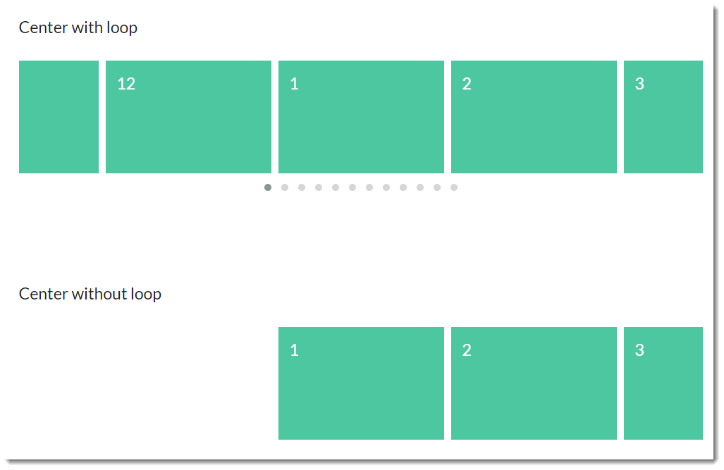
| loop | Plays the carousel on infinite loop (instead of stopping at the end or rewinding back to the beginning). | |
| center | Centers the starting/current item and shows partial previous/next items | |
| mouseDrag | Allows dragging via mouse |
|
| touchDrag | Allows dragging on touchscreens |
|
| stagePadding | Adds padding (in pixels) to the stage, making part of the neighbouring, off-stage L/R items visible | |
| autoWidth | Allows variable width for items in the carousel | |
| startPosition | The slide number to start on when the page loads |
|
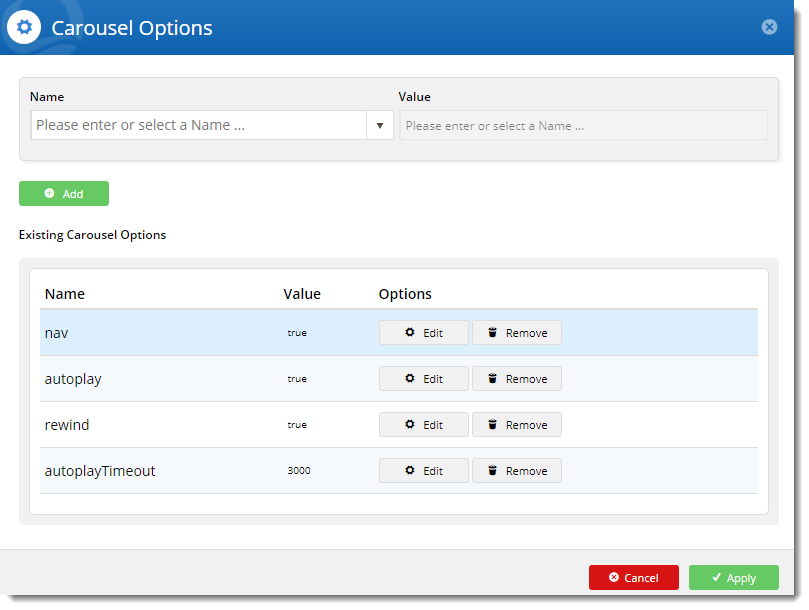
| nav | Shows next/prev buttons |
|
| rewind | Slides backward to the beginning of the carousel when the last item is reached (rather than looping forward to the first item) | |
| navText | The text for prev/next buttons when 'nav' is enabled (can use HTML) |
|
| navElement | When 'nav' is enabled, this is the HTML container type for prev/next buttons (defaults to div) |
|
| slideBy | Slides by whole page ('page') or by the specified number ('X') of slide items |
|
| dots | Shows dot indicators which can be used for navigation | |
| dotsEach | Specify 'true' to display a dot for each slide, or 'X' to show a dot for every 'X' slides |
|
| autoplay | Slides items automatically, without user intervention | |
| autoplayTimeout | The interval time (milliseconds) before autoplay begins, as well as between each slide animation |
|
| autoplayHoverPause | Pauses the animation on mouse hover |
|
| smartSpeed | The time (milliseconds) for all slide animations to complete. |
|
| autoplaySpeed | The time (milliseconds) for the autoplay slide animation to complete when autoplay is on. | |
| navSpeed | The time (milliseconds) for the next/prev navigation slide animation to complete (doesn't apply to dots or autoplay) |
|
| dotsSpeed | The time (milliseconds) for the dot navigation slide animation to complete (doesn't apply to next/prev or autoplay) |
|
| dragEndSpeed | The time (milliseconds) for the animation to complete once you stop dragging the slider left or right |
|
| callbacks | Listens for specific events and allows advanced .js manipulatiopn of the carousel (contact CV for assistance) |
|
| responsive | Allows advanced owl carousel option manipulation at different breakpoints |
|
| responsiveRefreshRate | The time (milliseconds) before the carousel refreshes after changing breakpoints |
|
| video | Allows video in tiles (requires specific HTML - contact CV for assistance) |
|
| videoHeight | Specifies video height |
|
| videoWidth | Specifies video width |
|
| animateOut | The animation effect when an item is exiting the user's view | Here's an example of the "FadeOut" AnimateOut effect: 
|
| animateIn | The animation effect when an item is entering the user's view | Here's an example of the "Tada" AnimateIn effect: 
|
| itemElement | The HTML container type for individual items (defaults to div) |
|
| stageElement | The HTML container type for the entire stage (defaults to div) |
|
| navContainer | Allows you to have the nav located in your own custom HTML container |
|
| dotsContainer | Allows you to have the dots located in your own custom HTML container |
|


