We have enhanced the "Show on Mobile?", "Show on Tablet?", and "Show on Desktop?" widget display options. When you toggle one or more of those device type displays to OFF, icons will display on the widget in the page template to indicate what devices will display (or not) that widget's content. |

This feature is best described through an example: Displaying the Questionnaire widget on the Contact Us Page on Desktop and Tablet devices but not Mobile devices.
1. Log into your CMS
2. Navigate to Content → Pages & Templates → Other Pages & Templates
3. Edit Contact Us Page
4. We have a Questionnaire widget located in the BottomRightThird zone.
5. We don't want the Questionnaire widget to display on Mobile devices, so we click on the Common Options tab and toggle Show On Mobile? to OFF.
6. Save your changes and Exit.
7. The device icons displayed against the widget tell us on which devices the widget will display or not:
Green: Display
Grey: Do Not Display
8. We can see the questionnaire on our Contact Us Page on the desktop
9. But there is not questionnaire on our Mobile device, as expected.
In the case of Banner sliders, you can use the same method to configure a banner image to display on any combination of the device types:
The Desktop, Mobile, and Tablet display options in each individual banner file in Banner Maintenance will show you how the image will appear on the relevant device.

1. Navigate to Content → Banners
2. In your Banner Maintenance window, select a banner.
3. Click Edit next to one of your banners.
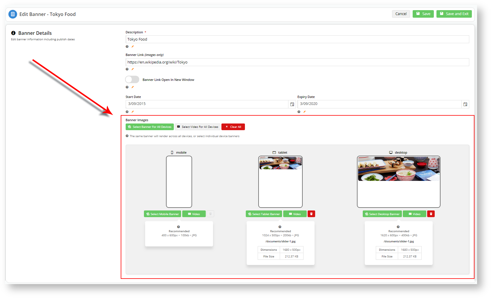
4. We are going to display the Tokyo Food banner on Tablet and Desktop device but not a Mobile.
5. Click Save and Exit.
6. When you log onto your site from a mobile, you should only see three (3) banners: Coffee, Hamburger, France.
The individual Banner Details: Banner Images settings takes precedence over the Show on <device>? switch in the Banner Slider widget. For instance, in the above screenshot, you have specified that mobile devices won't display the "Tokyo Food" banner. If you toggle Show on <device>? to ON for all device types in the Banner Slider widget, the "Tokyo Food" banner image will still not show up on mobile devices.
Banner Details: Banner Images settings override the Banner Slider widget settings. |
| The new device display toggle options will appear for sites running version 4.15 and above. |
| Minimum Version Requirements |
| |
|---|---|---|
| Prerequisites |
| |
| Self Configurable |
| |
| Business Function |
| |
| BPD Only? |
| |
| B2B/B2C/Both |
| |
| Ballpark Hours From CV (if opting for CV to complete self config component) |
| |
| Ballpark Hours From CV (in addition to any self config required) |
| |
| Third Party Costs |
| |
| CMS Category |
|
Related articles appear here based on the labels you select. Click to edit the macro and add or change labels.
Macro Instructions for carrying Article Information through to Feature List
Instructions for carrying Excerpts through from this page to the Feature List Article Page: Add macro / Multiexcerpt (or copy and existing excerpt and edit) or (Copy existing page and place content into existing excerpt macros) On Features List page: Click in the Cell to be populated / add macro / Multiexcerpt Include / Select the Article page and the excerpt (or copy another feature line and edit the 'Article page' source. |