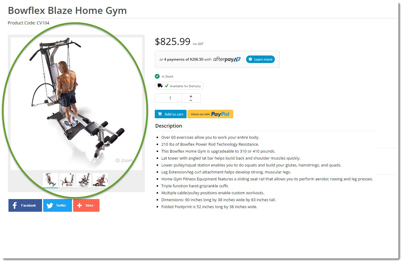
Renders the product gallery, which can include images as well as videos. |
Following is an example of the widget in use:

The widget can be used in the following templates:
| Option | Use | Comments | Available from Version |
|---|---|---|---|
| Description | A short description of the widget's use. | We recommended this field be updated so the widget's purpose is clear at a glance from the template page. | All |
| Layer | The layer the widget is valid for. | The layering technology allows for the content to be shown to specific audiences. This is handy if the content is only valid for a certain type of user, or if the same widget is required for more than one audience, but different configuration is needed. The widget can be added to the zone more than once and the layer feature can determine which audience can see each widget. | All |
| Image Path | The file path to the folder in which 500px product images are stored. | Default is: /images/ProductImages/500/ | All |
| Zoom Image Path | The file path to the folder in which full size product images are stored. | Default is: /images/ProductImages/ | All |
| Show Ribbons? | Determines whether product ribbons are displayed in the gallery. | Default is: enabled Untick to disable | All |
| Show Zoom? | Determines whether the image zoom link is displayed. Not applicable when the widget is used on the Product Quick View Popup template. | Default is: enabled Untick to disable | All |
| Include Videos? | Determines whether videos are included in the gallery. | Default is: enabled Untick to disable | All |
| Vimeo Text Colour | The hex code for the video title colour and other Vimeo elements. | Default is: bc3d54 | All |
| Zoom Prompt | The text displayed for the image zoom link. | Default is: Zoom | All |
| Show On Mobile? | Determines whether the widget is displayed on a mobile device. If unticked, the gallery will be hidden on mobile devices. | Default is: enabled Untick to disable | All |