Overview
BPD websites use a jQuery plugin called Owl Carousel to render responsive sliding carousels in widgets such as:
Owl Carousel 2 comes additional functionality, especially around transition animations and navigation.
| Multiexcerpt |
|---|
| hidden | true |
|---|
| MultiExcerptName | Feature Overview |
|---|
|
BPD websites use a jQuery plugin called Owl Carousel to render responsive sliding carousels in widgets. |
This article will detail the options available within the CMS, as well as show some working examples where practical.
Step-by-step guide
- When you edit one of the widgets listed above, you'll now see Carousel Options on the main tab.
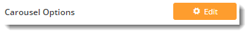
- Click Edit and a pop-up will open, showing any existing options that have been applied to that widget.
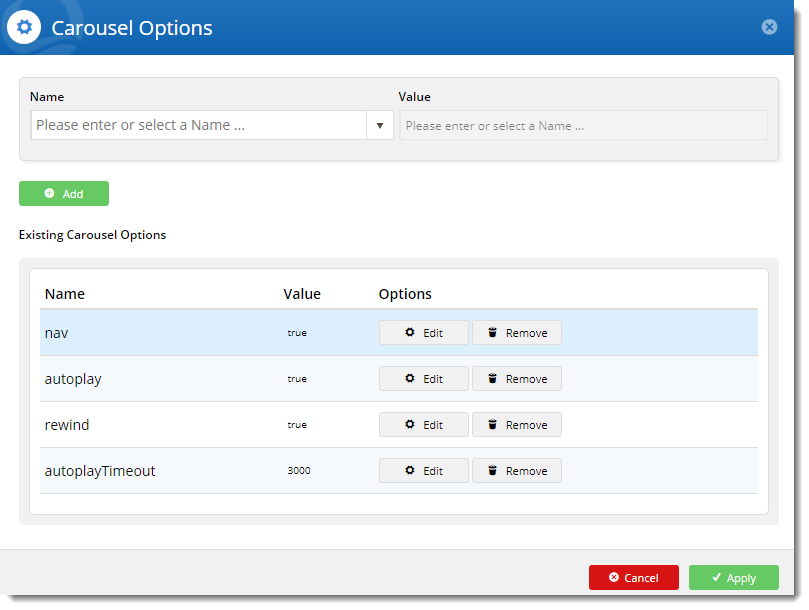
- From here, you can:
- update the value of existing options: click Edit on an option to change its current value, then click Update.
- add a new option: select an option from the dropdown, set the value, and click Add.
- remove unwanted options: click Remove on an existing option to remove it from the widget.
- Click Apply once you've finished, then Save your changes on the widget.
Here's an example
| Multimedia |
|---|
| name | EditingOwlCarouselOptionsInTheCMS.mp4 |
|---|
|
Carousel options
| Option name | Definition | Example |
|---|
| items | The number of items (product tiles, banners, articles) visible on the carousel stage at any one time | The default number of items is 3. The example below shows a carousel with "items" set to 5. 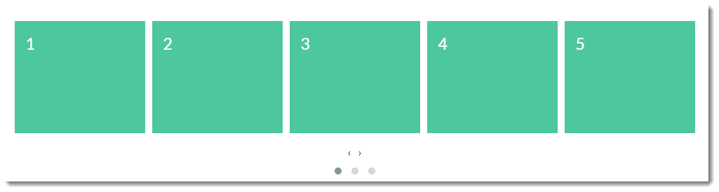
|
| margin | The right margin (in pixels) for each item |
|
| loop | Plays the carousel on infinite loop (instead of stopping at the end or rewinding back to the beginning). | | Multimedia |
|---|
| name | Function - Loop campaign slider with how to.mp4 |
|---|
|
|
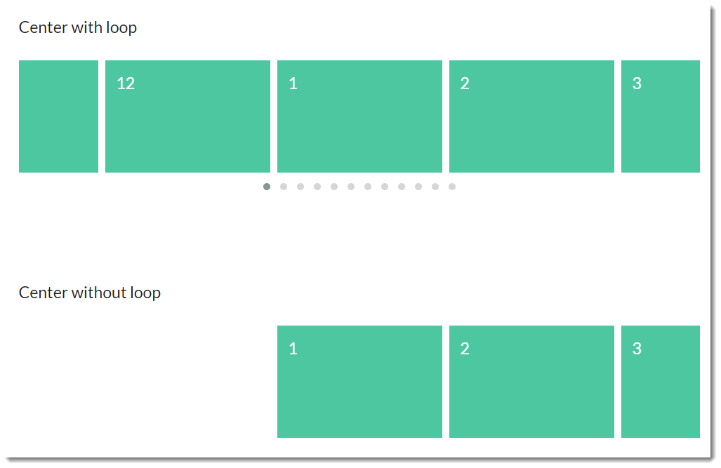
| center | Centers the starting/current item and shows partial previous/next items | |
| mouseDrag | Allows dragging via mouse |
|
| touchDrag | Allows dragging on touchscreens |
|
| stagePadding | Adds padding (in pixels) to the stage, making part of the neighbouring, off-stage L/R items visible | | Multimedia |
|---|
| name | Function - StagePadding banner slider.mp4 |
|---|
|
|
| autoWidth | Allows variable width for items in the carousel | |
| startPosition | The slide number to start on when the page loads |
|
| nav | Shows next/prev buttons |
|
| rewind | Slides backward to the beginning of the carousel when the last item is reached (rather than looping forward to the first item) | | Multimedia |
|---|
| name | Function - Rewind campaign slider with how to.mp4 |
|---|
|
|
| navText | The text for prev/next buttons when 'nav' is enabled (can use HTML) |
|
| navElement | When 'nav' is enabled, this is the HTML container type for prev/next buttons (defaults to div) |
|
| slideBy | Slides by whole page ('page') or by the specified number ('X') of slide items |
|
| dots | Shows dot indicators which can be used for navigation | | Multimedia |
|---|
| name | Function - Dots campaign slider with how to.mp4 |
|---|
|
|
| dotsEach | Specify 'true' to display a dot for each slide, or 'X' to show a dot for every 'X' slides |
|
| autoplay | Slides items automatically, without user intervention | | Multimedia |
|---|
| name | Function - Autoplay and Autoplay Speed with how to.mp4 |
|---|
|
|
| autoplayTimeout | The interval time (milliseconds) before autoplay begins, as well as between each slide animation |
|
| autoplayHoverPause | Pauses the animation on mouse hover |
|
| smartSpeed | The time (milliseconds) for all slide animations to complete. |
|
| autoplaySpeed | The time (milliseconds) for the autoplay slide animation to complete when autoplay is on. | | Multimedia |
|---|
| name | Function - Autoplay and Autoplay Speed with how to.mp4 |
|---|
|
|
| navSpeed | The time (milliseconds) for the next/prev navigation slide animation to complete (doesn't apply to dots or autoplay) |
|
| dotsSpeed | The time (milliseconds) for the dot navigation slide animation to complete (doesn't apply to next/prev or autoplay) |
|
| dragEndSpeed | The time (milliseconds) for the animation to complete once you stop dragging the slider left or right |
|
| callbacks | Listens for specific events and allows advanced .js manipulatiopn of the carousel (contact CV for assistance) |
|
| responsive | Allows advanced owl carousel option manipulation at different breakpoints |
|
| responsiveRefreshRate | The time (milliseconds) before the carousel refreshes after changing breakpoints |
|
| video | Allows video in tiles (requires specific HTML - contact CV for assistance) |
|
| videoHeight | Specifies video height |
|
| videoWidth | Specifies video width |
|
| animateOut | The animation effect when an item is exiting the user's view | Here's an example of the "FadeOut" AnimateOut effect: | Multimedia |
|---|
| name | Animation - AnimateOut fade out gallery slider with how to.mp4 |
|---|
|
|
| animateIn | The animation effect when an item is entering the user's view | Here's an example of the "Tada" AnimateIn effect: | Multimedia |
|---|
| name | Animation - AnimateIn Tada gallery slider with how to .mp4 |
|---|
|
|
| itemElement | The HTML container type for individual items (defaults to div) |
|
| stageElement | The HTML container type for the entire stage (defaults to div) |
|
| navContainer | Allows you to have the nav located in your own custom HTML container |
|
| dotsContainer | Allows you to have the dots located in your own custom HTML container |
|
Animations
With the animateIn and animateOut options you'll notice lots of choices for effects. Due to the sheer number available, it's impractical to display demo videos for each one here, but we've included a few of the more popular effects.
However, you can see for yourself how each animation behaves on the Animate.css webiste: https://daneden.github.io/animate.css/
|
|---|
|
|---|
|
|---|
|
|---|
slideInLeft
| Multimedia |
|---|
| name | AnimateSlideInLeft.mp4 |
|---|
|
|
|---|
Other animate effects available:
- pulse
- rubber band
- shake
- swing
- tada
- wobble
- jello
- bounceIn
- bounceInDown
- bounceInLeft
- bounceInRight
- bounceInUp
- bounceOut
- bounceOutDown
- bounceOutLeft
- boounceOutRight
- bounceOutUp
- fadeIn
- fadeInDown
- fadeInDownBig
- fadeInLeft
- fadeInLeftBig
- fadeInRight
- fadeInRightBig
- fadeInUp
- fadeInUpBig
- fadeOut
- fadeOutDown
- fadeOutDownBig
- fadeOutLeft
- fadeOutLeftBig
- fadeOutRight
- fadeOutRightBig
- fadeOutUp
- fadeOutUpBig
- flip
- flipOutX
- flipOutY
- lightSpeedIn
- lightSpeedOut
- rotateIn
- rotateInDownLeft
- rotateInDownRight
- rotateInUpLeft
- rotateInUpRight
- rotateOut
- rotateOutDownLeft
- rotateOutDownRight
- rotateOutUpLeft
- rotateOutUpRight
- slideInUp
- slideInDown
- slideInRight
- slideOutUp
- slideOutDown
- slideOutLeft
- slideOutRight
- zoomIn
- zoomInUp
- zoomInDown
- zoomInLeft
- zoomInRight
- zoomOut
- zoomOutUp
- zoomOutDown
- zoomOutLeft
- zoomOutRight
- hinge
- jackInTheBox
- rollIn
- rollOut
| Content by Label |
|---|
| showLabels | false |
|---|
| max | 10 |
|---|
| showSpace | false |
|---|
| title | Related Articles |
|---|
| cql | label in ("banners","articles","campaigns","cms") |
|---|
|
| Multiexcerpt |
|---|
| MultiExcerptName | Additional Info |
|---|
|
4.05+ will automatically use version 2 of the Owl Carousel. |
| Minimum Version Requirements |
| Multiexcerpt |
|---|
| MultiExcerptName | Minimum Version Requirements |
|---|
| | 04.05.00 |
|
|---|
| Prerequisites | |
|---|
| Self Configurable |
| Multiexcerpt |
|---|
| MultiExcerptName | Self Configurable |
|---|
| Yes |
|
|---|
| Business Function |
| Multiexcerpt |
|---|
| MultiExcerptName | Business Function |
|---|
| Marketing |
|
|---|
| BPD Only? | |
|---|
| B2B/B2C/Both |
| Multiexcerpt |
|---|
| MultiExcerptName | B2B/B2C/Both |
|---|
| Both |
|
|---|
| Third Party Costs |
| Multiexcerpt |
|---|
| MultiExcerptName | Third Party Costs |
|---|
| | n/a |
|
|---|
| Content by Label |
|---|
| showLabels | false |
|---|
| max | 5 |
|---|
| showSpace | false |
|---|
| excludeCurrent | true |
|---|
| cql | label in ("banners","campaigns","article","images") |
|---|
|