Widget Use
| Excerpt |
|---|
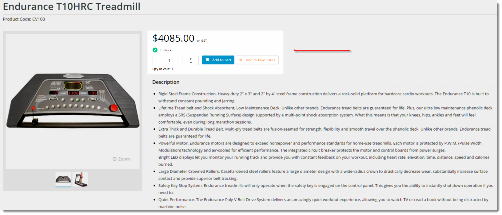
Show Renders the products purchasing details for a product, such as price, availability, and quantity in cart, as well as the Add to Cart and Add to Favourites buttons. |
Example of Widget Use
Following is an example of the widget in use:
Where can the Widget be placed?
The widget can be used in the following templates:
- Product Detail Template
Widget Options
| Option | Use | Comments | Available from Version | |
|---|---|---|---|---|
| Description | The A short description of the widgetIt is recommended to use this so the reason for use of the widget is seem 's use. | We recommended this field be updated so the widget's purpose is clear at a glance from the template page. | All | |
| Layer | The layer thatthe widget will be shown onis valid for. | The layering technology allows for the content to be shown to specific audiences. This is handy if the content is only valid for a certain type of user, or if the same widget is required for more than one audience, but different configuration is needed. The widget can be added to the zone more than once and the layer feature can determine which audience can see each widget. | All | |
| Show Favourites Button? | Default is: The favourites button will only display when the user is logged in. | |||
| Show Quantity In Cart? | Default is: | |||
| Show RRP? | Determines whether the product's Recommended Retail Price is displayed. | Default is: | ||
| RRP Prompt | The label for the RRP field. | Default is: | ||
| Show Quantity Breaks? | Determines whether pricing quantity breaks are displayed. | Default is: | ||
| Quantity Breaks Prompt | The label for the quantity break display. | Default is: | ||
| My Price Prompt | The label for the 'My Price' field. | Default is: | ||
| Increase Quantities In Pack Qty? | Forces the value in the quantity field to increase/decrease in pack quantities when using the plus/minus icons, rather than by the default quantity of 1. | Default is: This will make the values in the quantity box go up and down by pack quantity values when clicking on the plus and minus icons | ||
| Show Availability? | Determines whether stock availability is displayed. | Default is: | ||
| Use Role Flag To Hide Availability? | Determines whether the role flag is obeyed in regard to stock availability display. | Default is: | ||
| In Stock Prompt | The text displayed for available products. | Default is: | ||
| Out Of Stock Prompt | The text displayed for unavailable products. | Default is: | ||
| Show Quantities? | Determines whether available quantity is displayed. | Default is: | ||
| Cost Centre Prompt | The label for the cost centre input field. | Default is: | ||
| Add To Cart Button Text | The text on the Add To Cart button. | Default is: | ||
| Attributed Product Price Display | Default is: | |||
| In Stock Prompt | Default is: | |||
| Out Of Stock Prompt | Default is: | |||
| Show Quantities? | Default is: | |||
| Use Role Flag To Hide Availability? | Default is: | |||
| Delivery Available Text | The The text displayed when the product is available for delivery. | Default is: Available Available for Delivery | ||
| Delivery Unavailable Text | The The text displayed when the product is NOT available for delivery. | Default is: Unavailable Unavailable for Delivery | ||
| Delivery Call To Order Text | The The delivery text displayed when the product is a special order. | Default is: Call Call To Order | ||
| Delivery Select Product Attributes Text | The The delivery text displayed for a master product, when the user has not yet selected options. | Default is: Please Please select a product | ||
| Delivery Available Tooltip | The The tooltip text displayed when the product is available for delivery. | Default is: Available Available for Delivery | ||
| Delivery Unavailable Tooltip | The The tooltip text displayed when the product is NOT available for delivery. | Default is: Unavailable Unavailable for Delivery | ||
| Delivery Call To Order Tooltip | The The delivery tooltip text displayed when the product is a special order. | Default is: Call Call To Order | ||
| Delivery Select Product Attributes Tooltip | The The delivery tooltip text displayed for a master product, when the user has not yet selected options. | Default is: Please Please select a product | ||
| Pickup Available Text | The The text displayed when the the product is available for pickup. | Default is: Available Available for Pickup | ||
| Pickup Unavailable Text | The The text displayed when the the product is NOT available for pickup. | Default is: Unavailable Unavailable for Pickup | ||
| Pickup Low Stock Call To Order Text | The The text displayed when the product has limited stock for pickup at the selected location. | Default is: Low Low Stock - Call To Order | ||
| Pickup Call To Order Text | The The pickup text displayed when the product is a special order. | Default is: Call Call To Order | ||
| Pickup Select Product Attributes Text | The The pickup text displayed for a master product, when the user has not yet selected options. | Default is: Please Please select a product | ||
| Pickup Store Not Set Text | The The text displayed when the user has not yet set their store, in which case the system is unable to calculate store pickup availability. | Default is: Not Not Set | ||
| Pickup Available Tooltip | The The tooltip text displayed when the the product is available for pickup. | Default is: Available Available for Pickup | ||
| Pickup Unavailable Tooltip | The The tooltip text displayed when the the product is NOT available for pickup. | Default is: Unavailable Unavailable for Pickup | ||
| Pickup Low Stock Call To Order Tooltip | The The tooltip text displayed when the product has limited stock for pickup at the selected location. | Default is: Low Low Stock - Call To Order | ||
| Pickup Call To Order Tooltip | The The pickup tooltip text displayed when the product is a special order. | Default is: Call Call To Order | ||
| Pickup Select Product Attributes Tooltip | The The pickup tooltip text displayed for a master product, when the user has not yet selected options. | Default is: Please Please select a product | ||
| Pickup Store Not Set Tooltip | The The tooltip text displayed when the user has not yet set their store, in which case the system is unable to calculate store pickup availability. | Default is: Not Not Set |
Other Widgets
| Content by Label | ||||||||||||||||
|---|---|---|---|---|---|---|---|---|---|---|---|---|---|---|---|---|
|