Widget Use
| Excerpt |
|---|
Shows Renders the children elements of a specific menu item. |
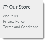
Example of Widget Use
Where can the Widget be placed?
...
| Option | Use | Comments | Available from Version |
|---|---|---|---|
| Description | A short description of the widget's use. | It is We recommended to usethis field be updated so the reason for use of the widget is seemwidget's purpose is clear at a glance from the template page. | All |
| Layer | The layer the widget is valid for. | The layering technology allows for the content to be shown to specific audiences. This is handy if the content is only valid for a certain type of user, or if the same widget is required for more than one audience, but different configuration is needed. The widget can be added to the zone more than once and the layer feature can determine which audience can see each widget. | All |
| Section Menu Item Code | This refers to the Section Menu Item code that is created in the Menu Editor in the CMS. | ||
| List Heading | The heading list is the heading for the Section Menu that will be section menu, displayed above the Menu Listmenu list. | This will not display on a feature navigation. | |
| Heading LinkThis is the URL that the List Heading will link to if | clickedThe URL the user is directed to on click of the heading link. | This will allow you to assign a link to the heading, by default this is empty. | |
| Heading Icon | This is the Icon that is The icon displayed next to the List Heading list heading, above the Section Menu Listsection menu list. | This will add an icon class to the list heading. | |
| Heading Icon PositionDetermine | if the Icon that was picked in the previous option is displayed to the left or right of the List HeadingDetermines the heading icon placement in relation to the heading. | This allows you to have the icon on the left or right hand side of the heading. It defaults to left if not set and will also be set to left if the section menu is a dropdown menu. Default is: Left | |
| Show Menu Item Icons? | Determines whether the items in the list with included icons will display the icon next to the Menu Item. | Default is: Unticked Tick to Enable | |
| Menu Icon Position | Determines if the Menu Item Icons are displayed on the left or the right of the Menu Itemthe menu icon placement in relation to the menu item. | This allows you to have the icon on the left or right hand side of the menu items. It defaults to left if not set. Default is: Left | |
| Is Feature Navigation Menu? | If this option is ticked it will display the menu in a vertical layout instead of the default horizontal layout. It is recommended that this this option is only selected if the menu is intended to be a feature navigation menu. | Default is: Unticked Tick to Enable | |
| Is Dropdown Menu? | Enabling this option will make all items in the section menu to be placed into a dropdown menu. If the "Is Feature Navigation Menu?" is ticked, enabling this option will have no effect. | Default is: Unticked Tick to Enable | |
| Show On Mobile? | Determines whether the widget is displayed on a mobile device. If unticked, the HTML snippet section menu will be hidden on mobile devices. | Default is: ticked Untick to disable | |
| Show Only Icon On Mobile? | Determines whether just the icon is displayed on mobile devices. If ticked the prompt text will be hidden on mobile devices. | Default is: ticked Untick to disable | |
| Right Align? | Pushes the widget to the right of the zone it is located in. | Default is: unticked Tick to enable |
...