Widget Use
| Excerpt |
|---|
Renders the default image of products in the zoned list view.hotspot banner in a cluster category. When a user clicks on a product image on the banner, they are taken to the product on the cluster page. |
Example of Widget Use
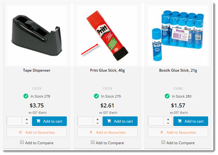
Following is an example of the widget in use:

Where can the Widget be placed?
...
- Product List Item Zoned Template
- Product Quick View Modal Template
- Cluster Item Zoned Template
Widget Options
| Option | Use | Comments | Available from Version |
|---|---|---|---|
| Description | A short description of the widget's use. | We recommended this field be updated so This description is added to the widget title. It makes the widget's purpose is clear at a glance from use clear on the template page. | All |
| Layer | The layer the widget is valid for. | The layering technology allows for the content to be shown to specific audiences. This is handy if the content is only valid for a certain type of user, or if the same widget is required for more than one audience, but different configuration is needed. The widget can be added to the zone more than once and the layer feature can determine which audience can see each widget. | All |
| Show Ribbons? | Determines whether product ribbons are displayed on the image in the list. | Default is: ticked Untick to disable | All | Product URL Prefix | The prefix inserted into the product URL before the product name. Primarily used during existing site upgrades to BPD, where it is desirable to maintain existing URLs. | All |
| Use Hyperlink? | Determines whether the product image is hyperlinked to the product's detail page. | Default is: ticked Untick to disable | All | Override Image Url Prefix | The prefix inserted into the image filepath for products in the list. Useful for overriding the default image and displaying an alternative set of images in the product list instead. | All |
| Product Picture to Use | Determines the particular product image to be displayed (eg. Picture 1, Picture 2, etc). | Default is: Picture 1 | 3.88 |
...
Use layering to limit widget content to certain groups of users. To use the same widget for more than one user group but with different options set, add the widget as many times as needed in the same zone. Then add layering to define the user group each time. | All | ||
| Hotspot Width | The width of the hotspot clickable area. | Default: 40 pixels | 4.31 |
| Hotspot Scroll Offset From Top (pixels) | The position of the linked product's details from the top of the screen after user clicks the hotspot. | Default: 200 pixels | 4.31 |
Related Resources
| Content by Label | ||||||||||||||||||||
|---|---|---|---|---|---|---|---|---|---|---|---|---|---|---|---|---|---|---|---|---|
|