Widget Use
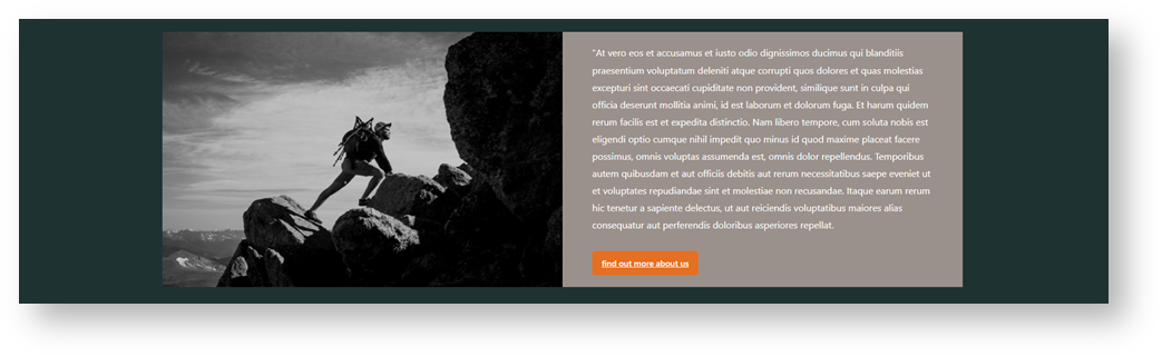
Renders a design and layout from two side by side content tiles configuring this widget's options.Example of Widget Use
Where can the Widget be placed?
The widget can be used in the following templates:
- All Page Templates
Widget Options
| Option | Use | Comments | Available from Version |
|---|---|---|---|
| Description | A short description of the widget's use. | This description is added to the widget title. It makes the widget's use clear on the template page. | All |
| Layer | The layer the widget is valid for. | Use layering to limit widget content to certain groups of users. To use the same widget for more than one user group but with different options set, add the widget as many times as needed in the same zone. Then add layering to define the user group each time. | All |
| Background Colour | Select a colour to change the background colour. | The colour range available are those intetegrated from your style guide. | 4.37 |
| Hyperlink (left side) | You can set the image to be left or right hand side and vice versa simply by selecting how you populate the content in the edit section. There is a (Left Side) content area and a (Right Side) content area: | Default is: ticked | 4.37 |
| Background Image (Left Side) | Pushes the widget to the right of the zone it is located in. | Tick to enable | 4.37 |
| Static Content (left side) | You can set the content to be left aligned, center align or right aligned by using the native editor tools: |
|

Related
-
Static Content Widget — Renders static content on the page (text, tables, links), with support for your site's Style Guide.