...
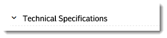
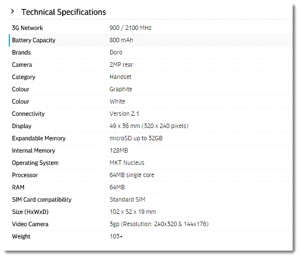
Following is an example of the widget in use:
| Without Toggle | With Toggle |
|---|---|
| Hidden (default view on page load)
Expanded (on click of heading)
|
Where can the Widget be placed?
...
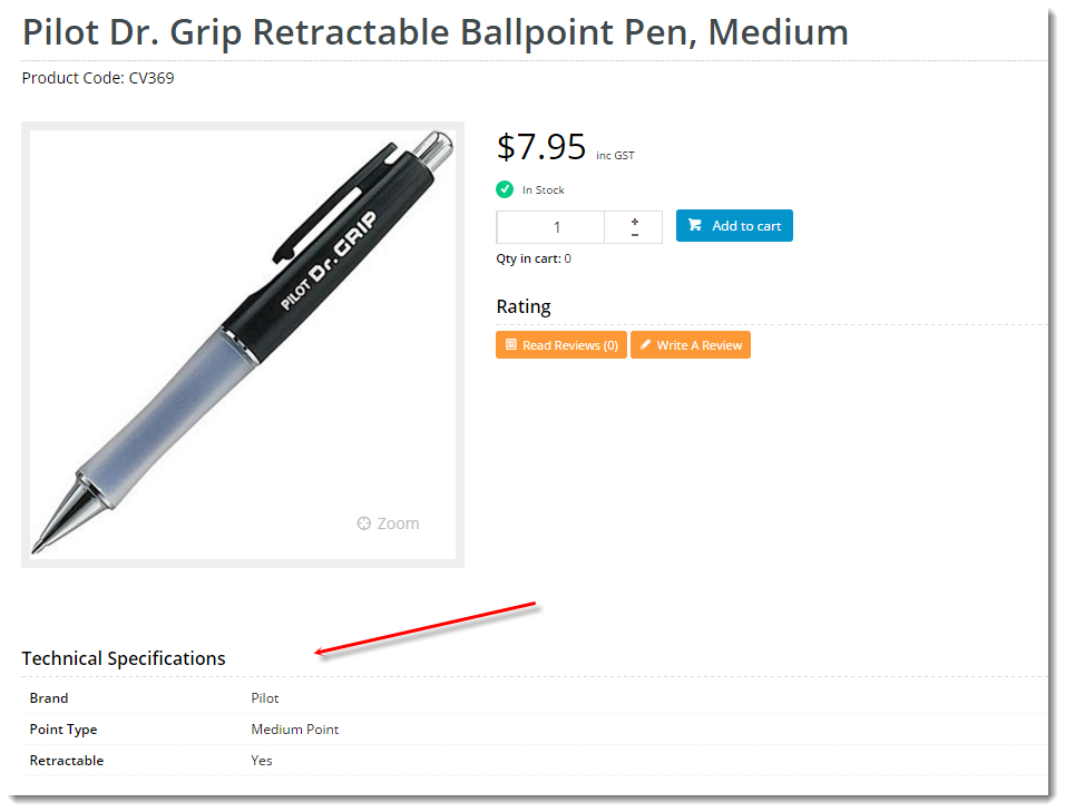
- Product Detail Template
Widget Options
| Option | Use | Comments | Available from Version |
|---|---|---|---|
| Description | A short description of the widget's use. | We recommended this field be updated so the widget's purpose is clear at a glance from the template page. | All |
| Layer | The layer the widget is valid for. | The layering technology allows for the content to be shown to specific audiences. This is handy if the content is only valid for a certain type of user, or if the same widget is required for more than one audience, but different configuration is needed. The widget can be added to the zone more than once and the layer feature can determine which audience can see each widget. | All |
| Show Heading? | Determines whether a heading / title is displayed at the top of the widget. | Default is: ticked Untick to disable | All |
| Heading Text | The heading text displayed (where heading is enabled). | Default is: Technical Specifications | All |
| Show |
| Toggle? |
With toggle functionality, the content is hidden by default, and only displayed when the user clicks on the heading. | Default is: |
unticked |
Tick to |
enable |
| 3.96 |
Other Widgets
| Content by Label | ||||||||||||||||||||
|---|---|---|---|---|---|---|---|---|---|---|---|---|---|---|---|---|---|---|---|---|
|