Widget Use
| Excerpt |
|---|
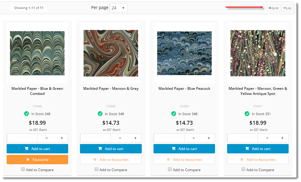
Allows you to add a widget to change the layout display for a product listGives the user various layout options to choose from when viewing a list of products. |
Example of Widget Use
Following is an example of the widget in use:
Where can the Widget be placed?
The widget can be used in the following templates:
- Product List Template
Widget Options
| Option | Use | Comments | Available from Version | ||
|---|---|---|---|---|---|
| Description | The A short description of the widgetIt is recommended to use this so the reason for use of the widget is seem 's use. | We recommended this field be updated so the widget's purpose is clear at a glance from the template page. | All | ||
| Layer | The layer that the widget will be shown onis valid for. | The layering technology allows for the content to be shown to specific audiences. This is handy if the content is only valid for a certain type of user, or if the same widget is required for more than one audience, but different configuration is needed. The widget can be added to the zone more than once and the layer feature can determine which audience can see each widget. | All | ||
| List Types | Create The layout options offered to the user, in comma-separated format. You can feature up to 3 different listtypes. Typically Grid, List orChoose from:
| Default is: Grid,DetailedList | |||
| List Prompts | Create up to 3 different list prompts. This is a comma separated list. Typically Grid, List or DetailedList The labels for the layout options offered to the user, in comma-separated format. The order should correspond to the List Types offered. Common labels:
| Default is: Grid,List | |||
| List Icons | Create up to 3 different list icons. This is a comma separated list.The icons displayed to the left of each list prompt, in comma-separated format. The order should correspond to the List Types offered. | Default is: cv-ico-general-layout,cv-ico-general-list | |||
| List Classes | Change the The class applied to the wrapping container when a different list type is selectedfor each list type, in comma-separated format. The order should correspond to the List Types offered. | Default is: grid,detailed-list | |||
| Use Default List Types? | Determines whether the default list types specified for B2B vs B2C are used for those audiences. | If there is more than 1 of this widget on the page, please only set this for one of them. | |||
| B2B Default List | Change the The default list presented to a B2B user when they layout for B2B users who have not already selected or changed their list type. | Default is: DetailedList | |||
| B2C Default List | Change the The default list presented to a B2C user when they layout for B2C users who have not already selected or changed their list type. | Default is: Grid | |||
| Container Class / ID | The element class or ID which wraps the list. | Default is: #product-grid Refer to your site's style guide for options. | |||
| Auto Scroll To Top? | Scrolls the page Determines whether the user is automatically scrolled to the top of the list when the user changes the list typepage after changing the list type. | Default is: unticked Tick to enable | |||
| Scroll Container Class / ID | The element class or ID to scroll to during auto-scroll. | Default is: #product_display_container | |||
| Scroll Speed | Controls the The speed at which the page scrolls to the top of the list. It can be represented as with words like slow or fast, or in milliseconds (600). | Default is: fast | |||
| Show On Mobile? | Determines whether the widget is displayed on a mobile device. If unticked, the layout switch will be hidden on mobile devices. | Default is: ticked Untick to disable |
Other Widgets
| Content by Label | ||||||||||||||||
|---|---|---|---|---|---|---|---|---|---|---|---|---|---|---|---|---|
|
