Widget Use
| Excerpt |
|---|
Describe what the purpose of the widget isRenders Quick Order Entry lines on a page, in a configurable format. |
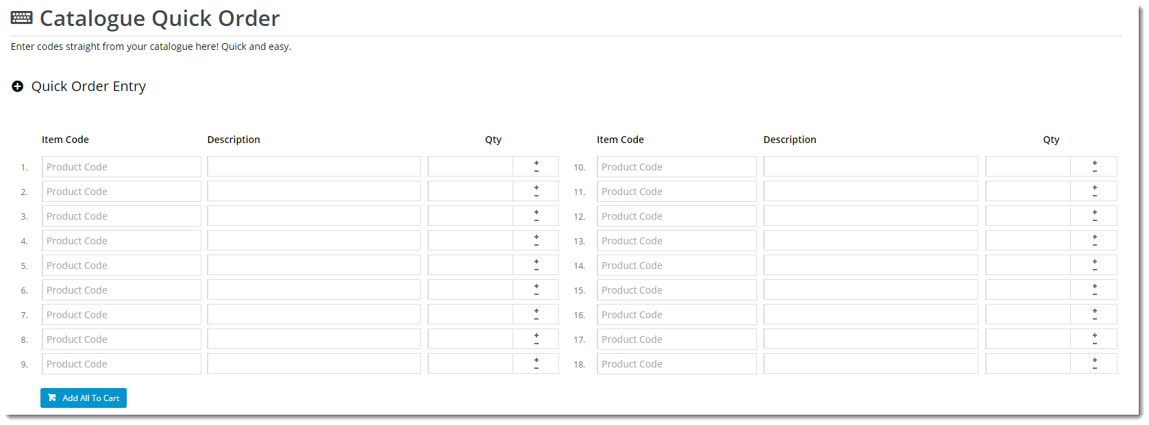
Example of Widget Use
Following is an example of the widget in use:
Where can the Widget be placed?
The widget can be used in the following templates:
- All Page Templates
Widget Options
| Option | Use | Comments | Available from Version | |||||
|---|---|---|---|---|---|---|---|---|
| Description | The A short description of the widget It is recommended to use this so the reason for use of the widget is seem's use. | We recommended this field be updated so the widget's purpose is clear at a glance from the template page. | All | |||||
| Layer | The layer that the widget will be shown onis valid for. | The layering technology allows for the content to be shown to specific audiences. This is handy if the content is only valid for a certain type of user, or if the same widget is required for more than one audience, but different configuration is needed. The widget can be added to the zone more than once and the layer feature can determine which audience can see each widget. | All | |||||
| Heading | The heading text displayed at the top of the widget. | Default is: Quick Order Entry | ||||||
| Heading Icon | The icon displayed to the left of the heading text. | Default is: cv-ico-general-plus2 | ||||||
| Number Of Columns? | Number The number of columns in which the quick order entry lines will be arranged. | Default is: 1 | ||||||
| Number Of Lines Per Column | Number The number of quick order entry lines in each column. | Default is: 1 | ||||||
| Products Added Message | Multi line add success messageThe message displayed on successful addition of multiple lines to cart. | Default is: These products have been successfully added: | ||||||
| Add All Error Message Format | Use The message displayed on failed addition of multiple lines to cart. The placeholders {0} and {1} are used for product code and error message, respectively. | Default is: {0} : {1} for error message
| ||||||
| Add All Button Label | The text displayed on the Add to Cart button. | Default is: Add All To Cart | ||||||
| Show Icons? | Determines whether icons are displayed for applicable fields (such as product code). | Default is: unticked Tick to enable | ||||||
| Code Placeholder Text | The text displayed in the product code field. | Default is: Product Code | ||||||
| Code Column Title | The heading displayed above the product code column. | Default is: Item Code | ||||||
| Show Description | Determines whether a product description field should display for each line. | Default is: ticked Untick to disable | ||||||
| Description Column Title | The heading displayed above the description column. | Default is: Description | ||||||
| Quantity Column Title | The heading displayed above the quantity column. | Default is: Qty | ||||||
| Use Predictive Search? | Determines whether predictive search is used in the product code fields. | Default is: ticked Untick to disable | ||||||
| Enable Cost Centres | Show cost centres in the quick order panelDetermines whether a cost centre field should display for each line. | Default is: unticked Tick to enable | ||||||
| Cost Centre Column Title | The heading displayed above the cost centre column. | Default is: Cost Centre | ||||||
| Enable Order Line Notes | Allow order line notes to be entered into the quick order panelDetermines whether a note field should display for each line. | Default is: unticked Tick to enable | ||||||
| Notes Column Title | The heading displayed above the note column. | Default is: Notes | ||||||
| Enable Rep Or User Price Override | Enable a rep or user able Determines whether reps or users are permitted to override prices in the quick order panel if they have the right to do so(dependant on user permissions). Adds an override price field for each line. | Default is: unticked Tick to enable | ||||||
| Override Price Column Title | The heading displayed above the override price column. | Default is: Price | ||||||
| Enable Rep Or User Discount Override | Allow discounts to be overriden by a rep or user to be entered into Determines whether reps or users are permitted to override discounts in the quick order panel (dependant on user permissions). Adds an override discount field for each line. | Default is: unticked Tick to enable | ||||||
| Override Discount Column Title | The heading displayed above the override discount column. | Default is: Discount | ||||||
| Show Description In Auto complete | Show Determines whether the product description is included in the autocomplete resultspredictive search / auto complete results. | Default is: ticked Untick to disable | ||||||
| Description Format | Format to be used to output the product descripion in the autocomplete resultsTBC | Default is: {0} | ||||||
| Show Code In Auto complete | Show Determines whether the product code is included in the autocomplete resultspredictive search / auto complete results. | Default is: ticked Untick to disable | ||||||
| Code Format | Format to be used to output the product code or APN is apn is used in the autocomplete resultsTBC | Default is: {0} | ||||||
| Show APN Instead Of Product Code | Determines whether the Australian Product Number is displayed in lieu of the product code. | Default is: unticked Tick to enable | ||||||
| Show Price In Automplete | Show the relevant price for the current user in the autocomplete resultsDetermines whether the product price is included in the predictive search / auto complete results. | Default is: ticked Untick to disable | ||||||
| Price Format | Format to be used to show the price in the autocomplete sectionTBC | Default is: {0} | ||||||
| Show GST Discriminator | Show the GST inclusive or exclusive text in the autocomplete sectionDetermines whether the GST descriminator (e.g. whether the price includes or excludes GST) is included in the predictive search / auto complete results. | Default is: ticked Untick to disable | ||||||
| GST Discriminator Format | Format to be used to display the GST DiscriminatorTBC | Default is: {0} GST | ||||||
| Including GST Text | The text that should be shown to indicate that a price includes GST. | Default is: inc | ||||||
| Excluding GST Text | The text that should be shown to indicate that a price excludes GST. | Default is: ex | ||||||
| Show Availability In Automplete | Show availability for the current user in the autocomplete results | Determines whether the product availability is included in the predictive search / auto complete results. | Default is: | |||||
| Availability Format | TBC | Default is: {0} Format to be used to output the product availability in the autocomplete results | ||||||
| In Stock Text | The text that should be shown to indicate that product is in stockdisplayed for available products. | Default is: In Stock | ||||||
| Out Of Stock Text | The text that should be shown to indicate that product is out of stockThe text displayed for unavailable products. | Default is: Out Of Stock | ||||||
| Low Stock Text | The text that should be shown to indicate that product is low in stockdisplayed for products which have reached the low stock threshold. | Default is: Low Stock | ||||||
| Low Stock Threshold | The quantity threshold below which availability should be will display as low stock'Low Stock'. Not displayed if set to 0 | Default is: 0 | ||||||
| Show Line Numbering | Show Determines whether line numbering against each of the line itemsis displayed for each product line on the form. | Default is: ticked Untick to disable | ||||||
| Line Numbering Column Title | The heading displayed above the line number column. |
| ||||||
| Line Numbering Format | Format to be used to output line numbers against each quick order entry lineTBC | Default is: {0}. | ||||||
| Start Line Numbering At | The starting number value for line numbering. | Default is: 1 | ||||||
| Show On Mobile? | Determines whether the widget is displayed on a mobile device. If unticked, quick order entry lines will be hidden on mobile devices. | Default is: ticked Untick to disable |
Other Widgets
| Content by Label | ||||||||||||||||
|---|---|---|---|---|---|---|---|---|---|---|---|---|---|---|---|---|
|