Widget Use
Enables the mobile menu, which flies out to the right of the mobile device screen when the user taps the menu link. The primary page slides to the left and dims slightly.Example of Widget Use
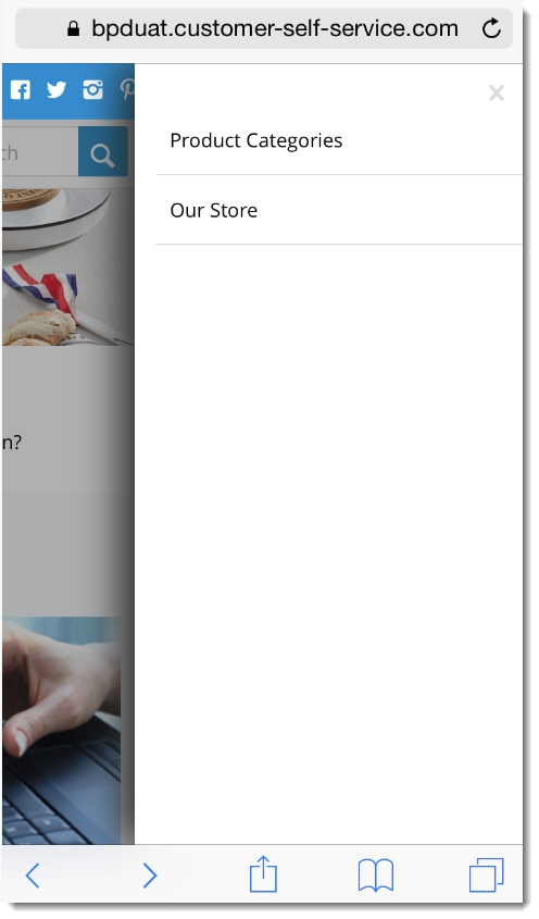
Following is an example of the widget in use:
Where can the Widget be placed?
The widget can be used in the following templates:
- All Templates
Widget Options
| Option | Use | Comments | Available from Version |
|---|---|---|---|
| Description | A short description of the widget's use. | We recommended this field be updated so the widget's purpose is clear at a glance from the template page. | All |
| Layer | The layer the widget is valid for. | The layering technology allows for the content to be shown to specific audiences. This is handy if the content is only valid for a certain type of user, or if the same widget is required for more than one audience, but different configuration is needed. The widget can be added to the zone more than once and the layer feature can determine which audience can see each widget. | All |
| Append / Prepend Category Menu? | Determines whether the category menu is inserted at the beginning or end of the site's main menu.
| Default is: Prepend | 3.81 |
| Insert Category At Location | This will override the Append / Prepend setting and insert the category menu at this particular location on the menu. | Locations are expressed numerically, so the first menu position would be 00, next 01, third would be 02, and so on. | 3.81 |
| Product Category Menu Text | The text displayed for the top level category link. | Default is: Product Categories | 3.81 |
| Product Category Menu url | The URL for the page the top category menu item links to. | Example: /products or /productdisplay.aspx | 3.81 |
| Product Category Menu Icon | The icon displayed to the left of the Product Category Menu text. | Select via drop-down. | 3.81 |
Related help
-
Mobile Menu Zoned Widget — Allows for a zoned Mobile Menu instead of the standard Mobile Menu, which adds flexibility to the menu's content and layout. With a zoned mobile menu, additional widgets such as images or HTML snippets, can be added.
A 'Menu' button is displayed in the mobile header, which slides the menu out to the right on click.
-
Targeting Banners by Device — Good news! From version 3.84+, banners can be configured to display on all devices, or targeted specifically for desktop or mobile only.
Even better, from version 4.02+, you can also target banners to your tablet users. This can be done on the banner image itself, as well as on the Banner Slider Widget.
-
Mobile Menu Widget — Enables the mobile menu, which flies out to the right of the mobile device screen when the user taps the menu link. The primary page slides to the left and dims slightly.