...
| Excerpt |
|---|
The Navigation Button widget is used to add adds a styled button which can link to either the previous page, home page, or shopping cart. |
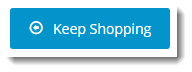
Example of Widget Use
Following is an example of the widget in use:
Where can the Widget be placed?
...
- All templates
Widget Options
| Option | Use | Comments | Available from Version |
|---|---|---|---|
| Description | A short description of the widget's use. |
| This description is added to the widget title. It makes the widget's |
| use clear on the template page. | All |
| Layer | The layer the widget is valid for. |
The layering technology allows for the content to be shown to specific audiences. This is handy
if the content is only valid for a certain type of user, or if the same widget is required for more than
one audience but different configurations are needed.
Use layering to limit widget content to certain groups of users. To use the same widget for more than one user group but with different options set, add the widget as many times as needed in the same zone. Then add layering to define the user group each time. | All |
| Button Label |
| Text on the button. | All | |
| Button Icon |
| Icon on the button. | Default: cv-ico-general-arrow-left6 Select via drop-down | All |
| Icon Position |
| Icon position |
| relative to the |
| text on the button |
| . | Default |
| : Left | All |
| Button Colour Type | Styles the button colour in line with |
site design. |
Options:
| Default: Primary | All |
| Button Colour Shade | Styles the button shade in line with |
site design. |
Options:
| Default: Normal | All |
| Button Type | Styles the button type in line with |
site design. |
Options:
| Default: Normal | All | |
| Button Size | Styles the button size in line with the site design. Possible values:
| Default: Large | All |
| Link Location |
Where the button links to:
| Default: Previous Page |
| All | |||
| Custom Page Url | Enables the button to link to any page. NOTE - If a custom page URL is entered, this will override any non-custom page Link Location selected. | Default: blank | 3.84 |
| Link Target | Select from:
| Default: Current Frame TIP - |
Blank or Current Frame is typically used. Top Frame and Parent Frame are for advanced users.
| 4.36 |
Related help
| Content by Label | ||||||||||||||||||||
|---|---|---|---|---|---|---|---|---|---|---|---|---|---|---|---|---|---|---|---|---|
|