Widget Use
| Excerpt |
|---|
Describe what the purpose of the widget isThe Navigation Button widget is used to add a styled button which can link to either the previous page, home page, or shopping cart. |
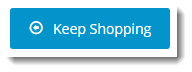
Example of Widget Use
Following is an example of the widget in use:
Where can the Widget be placed?
The widget can be used in the following templates:
- All templates
Widget Options
| Option | Use | Comments | Available from Version | ||
|---|---|---|---|---|---|
| Description | The A short description of the widgetIt is recommended to use this so the reason for use of the widget is seem 's use. | We recommended this field be updated so the widget's purpose is clear at a glance from the template page. | All | ||
| Layer | The layer that the widget will be shown onis valid for. | The layering technology allows for the content to be shown to specific audiences. This is handy if the content is only valid for a certain type of user, or if the same widget is required for more than one audience, but different configuration is needed. The widget can be added to the zone more than once and the layer feature can determine which audience can see each widget. | All | ||
| Button Label | The text displayed on the button. | ||||
| Button Icon | The icon displayed on the button. | Default is: cv-ico-general-arrow-left6 | |||
| Icon Position | The position of the icon on the button, relative to the text. | Default is: Left | |||
| Button Colour Type | Styles the button colour in line with the site design. Possible values:
| Default is: Primary | |||
| Button Colour Shade | Styles the button shade in line with the site design. Possible values:
| Default is: Normal | |||
| Button Type | Default is: Normal | ||||
| Button Size | Default is: Large | ||||
| Link Location | Determines where the button links to, options being:
| Default is: Previous Page Select via drop-down | |||
| Show On Mobile? | Enables the display of the widget on mobile devices. | Default is: ticked Tick to enable | |||
| Right Align? | Push element to the right" help="Turn this on to make the widget appear on the right hand side Pushes the widget to the right of the zone it is located in. | Default is: not ticked Tick to enable |
Other Widgets
| Content by Label | ||||||||||||||||
|---|---|---|---|---|---|---|---|---|---|---|---|---|---|---|---|---|
|