Widget Use
| Excerpt |
|---|
Displays Kit Component Product Information for Kit Based Products. |
component information (or 'Bill of Materials') for kit-based products. |
Example of Widget Use
Following is an example of the widget in use:
...
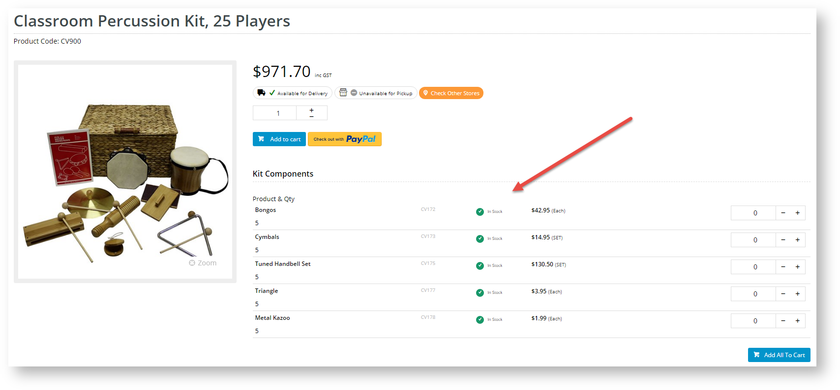
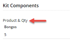
Kit Components
| Kit Components with Add to Cart
|

Where can the Widget be placed?
The widget can be used in the following templates:
- Product Detail Template
Widget Options
| Option | Use | Comments | Available from Version |
|---|---|---|---|
| Description |
A short description of the widget |
's use. | We recommend this field be updated so the widget's purpose is clear at a glance from the template page. | All |
| Layer | The layer |
| the widget |
| is valid for. | The layering technology allows for the content to be shown to specific audiences. This is handy |
if the content is only valid for a certain type of user, or if the same widget is required for more than |
one |
audience but different |
configurations are needed. The widget can be added to the zone more |
than once and the layer feature can determine which audience can see each widget. | All | ||
| Show Product Code? | Determines whether the kit component's product code is displayed. | Default: ON Toggle to disable | 3.81 |
| Show APN Instead Of Product Code? | Determines whether the kit component's Australian Product Number (APN) is displayed instead of its product code. | Default: OFF Toggle to enable | 3.81 |
| Show Product Description? | Determines whether the kit component's description is displayed. | Default: ON Toggle to disable | 3.81 |
| Show Product Quantity? | Determines whether the kit component quantity is displayed. | Default: ON Toggle to disable | 3.81 |
| Quantity Format | The format for display of quantity values. | Default: No Decimals | 3.81 |
| Use Zoned Template? | Determines whether kit components can be individually added to cart. | Default: OFF Toggle to enable | 3.81 |
| Label for Add All To Cart button | (Only if Zoned Template is used.) Text for the Add All to Cart button. Clicking this button adds any selected component products to cart. |
...
| Default: Add All To Cart | 4.31 | ||
| Display location for Add All button | (Only if Zoned Template is used.) Determines whether the Add All button is added at the top or bottom of the section, or in both locations. | Default: Bottom | 4.31 |
| Display type for zoned layout | (Only if Zoned Template is used.) Determines whether components are displayed in a list, grid or detailed list. | Default: list | 4.31 |
| Zoned Template Header | (Only if Zoned Template is used and a list display is selected. Consulting with Commerce Vision is required.) Text for the component product column headers. | Default: blank | 4.31 |
| Titles | Use | Comments | |
|---|---|---|---|
| Heading | The heading text displayed at the top of the widget. | Default: Kit Components | 3.81 |
| Product Code/APN Title | The heading text for the Product Code/APN column. | Default is: Code | 3.81 |
| Product Description Title | The heading text for the product description column. | Default is: Item | 3.81 |
| Product Quantity Title | The heading text for the product quantity column. | Default is: Qty | 3.81 |
Related help
| Content by Label | ||||||||||||||||||||
|---|---|---|---|---|---|---|---|---|---|---|---|---|---|---|---|---|---|---|---|---|
|