Widget Use
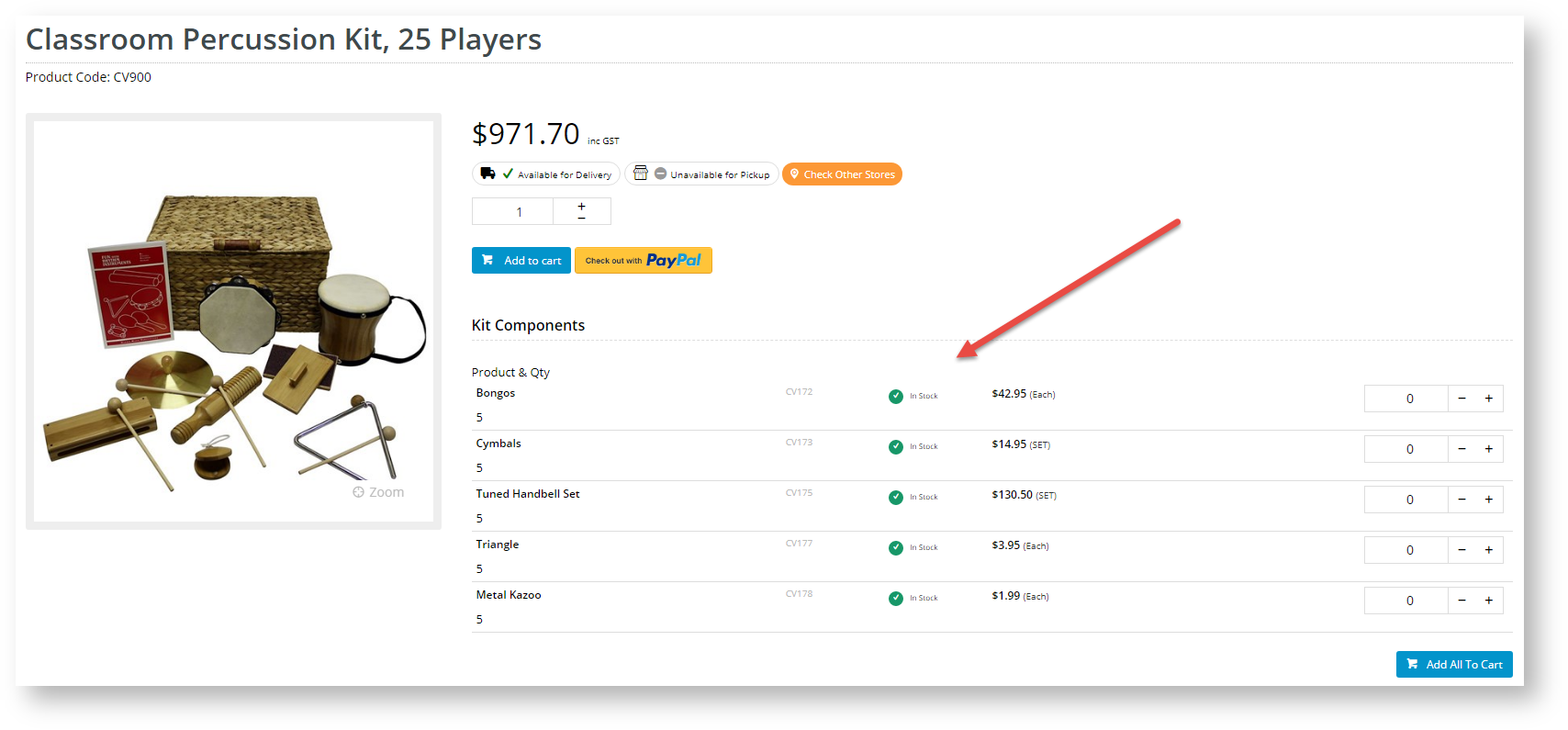
Displays component information (or 'Bill of Materials') for kit-based products.Example of Widget Use
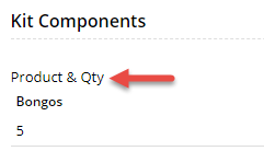
Kit Components
| Kit Components with Add to Cart
|

Where can the Widget be placed?
The widget can be used in the following templates:
- Product Detail Template
Widget Options
| Option | Use | Comments | Available from Version |
|---|---|---|---|
| Description | A short description of the widget's use. | We recommend this field be updated so the widget's purpose is clear at a glance from the template page. | All |
| Layer | The layer the widget is valid for. | The layering technology allows for the content to be shown to specific audiences. This is handy if the content is only valid for a certain type of user, or if the same widget is required for more than one audience but different configurations are needed. The widget can be added to the zone more than once and the layer feature can determine which audience can see each widget. | All |
| Show Product Code? | Determines whether the kit component's product code is displayed. | Default: ON Toggle to disable | 3.81 |
| Show APN Instead Of Product Code? | Determines whether the kit component's Australian Product Number (APN) is displayed instead of its product code. | Default: OFF Toggle to enable | 3.81 |
| Show Product Description? | Determines whether the kit component's description is displayed. | Default: ON Toggle to disable | 3.81 |
| Show Product Quantity? | Determines whether the kit component quantity is displayed. | Default: ON Toggle to disable | 3.81 |
| Quantity Format | The format for display of quantity values. | Default: No Decimals | 3.81 |
| Use Zoned Template? | Determines whether kit components can be individually added to cart. | Default: OFF Toggle to enable | 3.81 |
| Label for Add All To Cart button | (Only if Zoned Template is used.) Text for the Add All to Cart button. Clicking this button adds any selected component products to cart. | Default: Add All To Cart | 4.31 |
| Display location for Add All button | (Only if Zoned Template is used.) Determines whether the Add All button is added at the top or bottom of the section, or in both locations. | Default: Bottom | 4.31 |
| Display type for zoned layout | (Only if Zoned Template is used.) Determines whether components are displayed in a list, grid or detailed list. | Default: list | 4.31 |
| Zoned Template Header | (Only if Zoned Template is used and a list display is selected. Consulting with Commerce Vision is required.) Text for the component product column headers. | Default: blank | 4.31 |
| Titles | Use | Comments | |
| Heading | The heading text displayed at the top of the widget. | Default: Kit Components | 3.81 |
| Product Code/APN Title | The heading text for the Product Code/APN column. | Default is: Code | 3.81 |
| Product Description Title | The heading text for the product description column. | Default is: Item | 3.81 |
| Product Quantity Title | The heading text for the product quantity column. | Default is: Qty | 3.81 |
Related help