Widget Use
| Excerpt |
|---|
Outputs the product field informationRenders a list on the product detail page, with the option to add hyperlinks to other content. |
Example of Widget Use
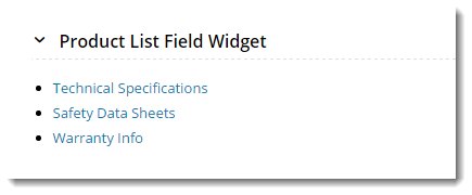
Following is an example of the widget in use:
Where can the Widget be placed?
The widget can be used in the following templates:
- Product Detail Template
Widget Options
| Option | Use | Comments | Available from Version | |||
|---|---|---|---|---|---|---|
| Description | The A short description of the widget It is recommended to use this so the reason for use of the widget is seem's use. | We recommended this field be updated so the widget's purpose is clear at a glance from the template page. | All | |||
| Layer | The layer thatthe widget will be shown onis valid for. | The layering technology allows for the content to be shown to specific audiences. This is handy if the content is only valid for a certain type of user, or if the same widget is required for more than one audience, but different configuration is needed. The widget can be added to the zone more than once and the layer feature can determine which audience can see each widget. | All | |||
| Product Field | The product field from which to draw data. This would often be a custom field created solely for this list information. | Please note - values in this product field should be entered in a semicolon-separated list. If there are links, a pipe symbol should separate the display value from the link value, e.g. 'Display text|Link value;Display text|Link value;' For example: Technical Specifications|Specs102134.pdf;Safety Data Sheets|SDS102134.pdf;Warranty Info|Warranty102134.pdf | All | |||
| Show Heading? | Determines whether a heading will be displayed. | Default is: ticked Untick to disable | All | |||
| Heading Text | The heading text (where heading is enabled). | All | ||||
| List Directory | If you your list contains links to items like PDFs, use this field to specify the folder in which they live. | For example: /documents/ | All | |||
| Show Toggle? | Allows the content to be hidden Determines whether the section can be expanded and collapsed by the user. The content is collapsed by default and displayed expanded when the user clicks on the heading. toggle arrows. | Default is: ticked Untick to disable | All | |||
| Show As List? | Display items in a 'ul' Determines whether the items are displayed in unordered list format (e.g. bullet points). When enabled, our example data would display as shown here, with links to the relevant PDF files:
When disabled, the data would display as follows: Technical Specifications Safety Data Sheets Warranty Info | Default is: ticked Untick to disable | All
| |||
| Show On Mobile? | Determines whether the widget is displayed on a mobile device. If unticked, the list field will be hidden on mobile devices. | Default is: ticked Untick to disable | All |
Other Widgets
| Content by Label | ||||||||||||||||
|---|---|---|---|---|---|---|---|---|---|---|---|---|---|---|---|---|
|