(Formerly known as the Product Attribute Grid widget)
Widget Use
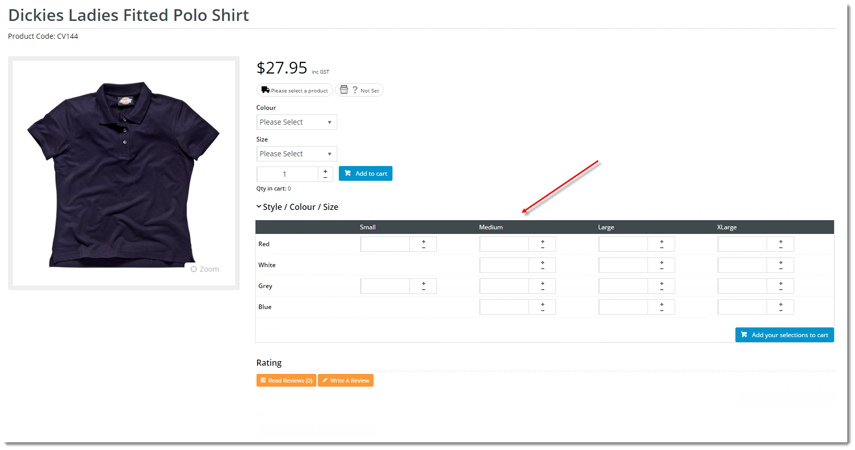
Renders 2-dimensional style / colour / size options for a product in a compact grid layout, instead of using the Product Attribute List display method. With the attribute grid, options are presented in a matrix where the user can enter quantities against multiple options and add their selections to the cart.Example of Widget Use
Following is an example of the widget in use:
Where can the Widget be placed?
The widget can be used in the following templates:
- Product Detail Template
- Product List Item Zoned Template
Widget Options
| Option | Use | Comments | Available from Version |
|---|---|---|---|
| Description | A short description of the widget's use. | Default: blank. We recommend a desciption is added so the widget's purpose is clear at a glance from the template page. | All |
| Layer | The layer the widget is valid for. | The layering technology allows for the content to be shown to specific audiences. This is handy if the content is only valid for a certain type of user, or if the same widget is required for more than one audience, but different configuration is needed. The widget can be added to the zone more than once and the layer feature can determine which audience can see each widget. | All |
| Show Heading? | Determines whether a heading is displayed to the customer above the attribute grid. | Default: ON If OFF, the customer does not have to click the drop-down arrow to display the product selection grid. We recommend disabling the Heading Text (turn off the Show Heading? button) so that the product variant grid displays automatically, encouraging buyers to use this easy selection method. | 3.88 |
| Heading Text | The heading displayed above the attribute grid (if enabled). | Default: Product Options | 3.88 |
| Add Button Text | The text on the Add to Cart button at the bottom of the attribute grid. | Default: Add selected to cart | 3.88 |
| Product Tooltip | The help text displayed when the user hovers over the quantity box for an option. The placeholders will be replaced as follows:
| Default: Price For Product {0} = {1} | 3.88 |
| Product Not Found Message Template | The message displayed to the user when they attempt to select an unavailable product. The placeholder {0} will be replaced with the selected combination (e.g. "Red, Small"). | Default: Product {0} Not Found | 3.88 |
| Increase Quantities In Pack Qty? | Determines whether values in the quantity box change in pack quantity values when the + / - buttons are used. | Default: OFF | 3.88 |
| Add Minimum Quantity to Cart? | Default: OFF |
Implementation Notes
- Only products with 2 attribute types can utilise the grid display; this widget will not render for products with fewer or more than 2 options.
- To enable a particular product for grid display, Product Matrix Mode must be set for that product.
- To ensure the product variant grid displays correctly in CSS, make sure Product Matrix Mode is allowed. See Product Variant Grid for more details.
- Please contact CV Support for assistance enabling multiple products in a bulk update.
Related help

