Widget Use
The Delivery Address B2C widget renders the relevant B2C billing and address fields during checkout.
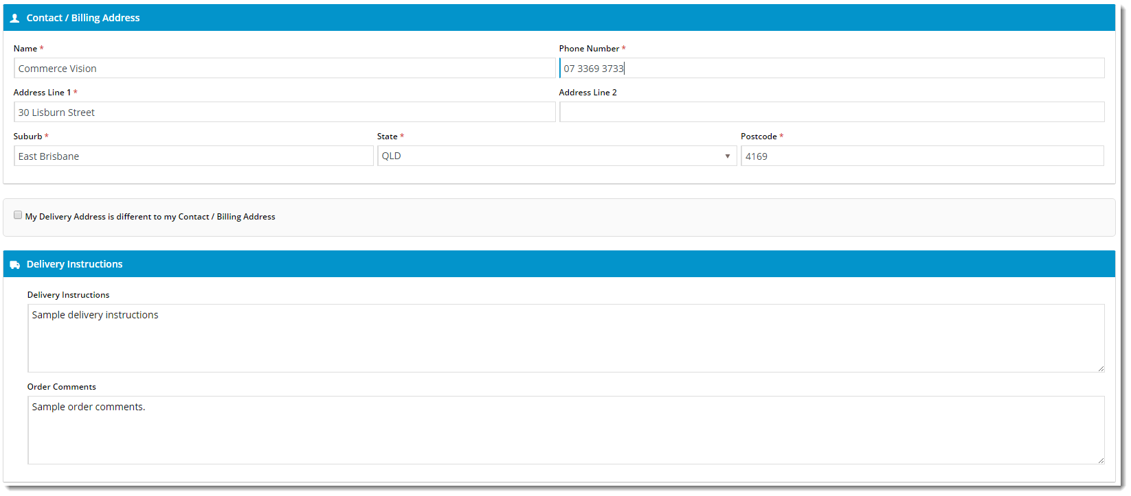
Example of Widget Use
Following is an example of the widget in use:
Where can the Widget be placed?
The widget can be used in the following templates:
- Checkout Template
Widget Options
| Option | Use | Comments | Available from Version |
|---|---|---|---|
| Description | A short description of the widget's use. | We recommended this field be updated so the widget's purpose is clear at a glance from the template page. | All |
| Layer | The layer the widget is valid for. | For this widget, the layer would generally be B2C. The layering technology allows for the content to be shown to specific audiences. This is handy | All |
| Billing Details Heading | |||
| Billing Details Heading Icon | |||
| Delivery Details Heading | |||
| Delivery Details Heading Icon | |||
| Use PostCode Validation? | |||
| Use Store Pickup? | Determines whether to offer the Pickup option to users during checkout (where there are pickup options available). | Default is: ticked Untick to disable | |
| Delivery Options Heading | The heading text displayed above the Delivery / Pickup selection. | Default is: Delivery Options | |
| Delivery Options Heading Icon | The icon displayed to the left of the Delivery Options Heading text. | Default is: cv-ico-general-shipping Select via drop-down | |
| Delivery Option Delivery Prompt | The text displayed for the Delivery option. | Default is: Delivery | |
| Delivery Option Pickup Prompt | The text displayed for the Pickup option. | Default is: Pickup | |
| Use Customer Reference? | Determines whether to display the Customer Reference field. | Default is: unticked Tick to enable | |
| Customer Reference Prompt | The text displayed for the Customer Reference field. | Default is: Customer Reference | |
| Create User Prompt | |||
| Create User Default Checked? | |||
| Delivery Address Updated Success Message | ?? | Default is: Delivery address updated successfully | |
| Missing Delivery Address Fields Message | The message text displayed when one or more of the mandatory address fields are left blank. | Default is: Not all the mandatory address fields have been populated | |
| Address Validation Title | |||
| Select Address Message | |||
| No Address Found Message | |||
| Check My Address Button Label | |||
| Address Is Valid Message | |||
| Address Validation Button Label | |||
| Address Validation Cancel Button Label | |||
| Delivery Instructions Heading | |||
| Delivery Instructions Heading Icon | |||
| Delivery Instructions Prompt | |||
| Delivery Instructions Updated Success Message | |||
| Pickup Instructions Heading | |||
| Pickup Instructions Heading Icon | |||
| Pickup Instructions Prompt | The text displayed for the Pickup Instructions field. | Default is: Pickup Instructions | |
| Pickup Instructions Updated Success Message | |||
| Order Comments Prompt | The text displayed for the Order Comments field. | Default is: Order Comments | |
| Order Comments Updated Success Message | ?? | Default is: Order comments updated successfully | |
| Show Country | Determines whether to include the Country address field. | Default is: unticked Tick to enable | |
| Country List | Colon and comma-separated list of Country values and labels, to be displayed in the rendered output. | The content before the colon is the Country value, the content after the colon is the Country label displayed to the user. For example: {'Argentina':'Argentina','Bermuda':'Bermuda','Bolivia':'Bolivia','Brazil':'Brazil','Belize':'Belize','Canada':'Canada','Chile':'Chile','Colombia':'Colombia'} | |
| State List | Colon and comma-separated list of State values and labels, relative to the selected Country. | The first entry corresponds to the value selected from the Country List. Then the states for that country are listed in the same format as the countries: The content before the colon is the State value, the content after the colon is the State label displayed to the user. For example: {'United States' : {'AL' : 'Alabama','AK' : 'Alaska','AZ' : 'Arizona','AR' : 'Arkansas','CA' : 'California','WY' : 'Wyoming'}} | |
| Show Authority To Leave? | Determines whether the Authority To Leave tickbox and options are displayed during checkout. | Default is: Unticked Tick to enable | |
| Leave At Alternative Location Prompt | The text displayed with the Authority To Leave tickbox. | Default is: Authority to leave at alternate location if you are unavailable | |
| Authority To Leave | Prompt text?? Where does this display?? | Default is: Authority To Leave | |
| Authority To Leave Options | Semicolon-separated list of authority to leave options, to be displayed in the rendered output. | Default is: Reception; Front Door; Front Porch; Front Verandah; In Carport; In Garage; In Letter Box; In Mail Box; Over Front Fence; Next To Wheelie Bins; Under Front Stairs | |
| Authority To Leave Format | The format in which to display the Authority To Leave options when rendering in the output. | Default is: Authority To Leave {0} (with {0} representing the list of options from 'Authority To Leave Options') | |
| Authority To Leave Updated Success Message | The confirmation text displayed when the user changes/updates the selected Authority To Leave option. | Default is: Authority to leave updated successfully |
Other Widgets
-
Order Payment Links Form Widget — Renders an order details stepper with an order form that can be automatically populated with query strings, and/or manually entered by the user. The form doesn't validate the order details are accurate in order to stay both secure and accessible to unauthenticated users.
-
Magic Link Authentication Message Widget — Renders the Magic Link authentication message.
-
CUSTOM_Side by Side Content Tiles Widget — Renders two side by side content tiles in a zone with widget options for selecting or adding background colour, image, text and link/button positioning.
-
Stock Dialog Widget — Displays the Stock to Receive Detail dialog window.
-
Stock to Receive Widget — Displays the Stock to Receive page.
-
Stock Levels Widget — Displays Stock Levels page.
-
Order Declined Pending 3rd Party Installment Msg Widget — Renders the message body for the email sent when the user selects to sign up and pay with a Buy Now Pay Later provider but approval is subject to further checks.
-
Order Field Static Widget — Renders an additional order field in email templates.
-
Online Quote Validation Widget — Renders the appropriate message to the user after the current status of an online quote accessed via an email link is validated.
-
Header Level Cost Centre Widget — Renders the cost centre input field on the order header in the shopping cart.
-
Openpay Summary Widget — Renders Openpay marketing information for a product on the product detail page. Use this widget instead of the Product Purchase Details widget if you want to customise tagline placement on the template.
-
Order Line Availability - Click and Collect Widget — Displays product availability and delivery methods at the order line level in dynamic scenarios such as the cart when Click & Collect is enabled.
-
Account Activation Email Content Widget — Renders the message content in the Invitation to Register an Account email.
-
Order Template Cost Centre Widget — Renders the cost centre input field on each product line in an order template.
-
BPAY Account Payment Detail Widget — Renders BPAY payment information in the body of the BPAY Account Payment email. This email is sent to users who pay invoices or pay down their account balance using BPAY.