Widget Use
Displays user login functionality.
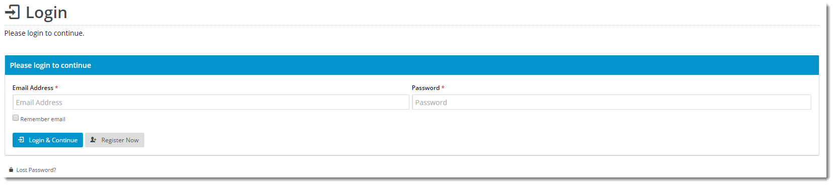
Example of Widget Use
Following is an example of the widget in use:

Where can the Widget be placed?
The widget can be used in the following templates:
- Login Page Template
Widget Options
| Option | Use | Comments | Available from Version |
|---|---|---|---|
| Description | A short description of the widget's use. | We recommended this field be updated so the widget's purpose is clear at a glance from the template page. | All |
| Layer | The layer the widget is valid for. | The layering technology allows for the content to be shown to specific audiences. This is handy if the content is only valid for a certain type of user, or if the same widget is required for more than one audience, but different configuration is needed. The widget can be added to the zone more than once and the layer feature can determine which audience can see each widget. | All |
| Title | The heading text displayed at the top of the widget. | Default is: Please login to continue | |
| User Name Prompt | The text displayed above and within the username input field. | Default is: Email Address | |
| Password Prompt | The text displayed above and within the password input field. | Default is: Password | |
| Show Remember Me? | Determines whether the 'Remember Me' tickbox is displayed. | Default is: ticked Untick to disable | |
| Remember Me Prompt | The label displayed next to the 'Remember Me' tickbox. | Default is: Remember email | |
| Keep Me Logged In Prompt | The label displayed next to the 'Keep Me Logged In' tickbox. | Default is: Keep me logged in | |
| Login Button Prompt | The text displayed on the Login button. | Default is: Login & Continue | |
| Password Requires Change Message | The message displayed to the user when a change of password is required. | Default is: You are required to change your password | |
| New Password Prompt | The placeholder text displayed in the first Change Password input box. | Default is: New Password | |
| Confirm Password Prompt | The placeholder text displayed in the second Change Password input box. | Default is: Confirm Password | |
| Notification Email Prompt | The placeholder text displayed in the notification email input box (under the 'My Details' tile on user's dashboard) | Default is: Notification Email Address | |
| Change Password Button Prompt | The text displayed on the Change Password button. | Default is: Change Password | |
| Change Password Button Icon | The icon displayed to the left of the Change Password button text. | Default is: cv-ico-general-cycle Select via drop-down | |
| Password Changed Message | The message displayed to the user when they have successfully reset their password. | Default is: Password changed | |
| Enter Password Message | The message displayed when the user clicks the Change Password button without first entering a password. | Default is: Please enter a password | |
| Show Self Register? | Determines whether the Register button is displayed. | Default is: ticked Untick to disable | |
| Register Icon | The icon displayed to the left of the text on the user registration button. | Default is: cv-ico-general-user-add Select via drop-down | |
| Register Prompt | The text displayed on the user registration button. | Default is: Register Now | |
| Show Forgot Password? | Determines whether the Forgot Password link is displayed, enabling users to request a password reset. | Default is: ticked Untick to disable | |
| Forgot Password Icon | The icon displayed to the left of the Forgot Password link text. | Default is: cv-ico-general-lock | |
| Forgot Password Prompt | The text displayed for the Forgot Password link. | Default is: Lost Password? |
Other Widgets
-
Order Payment Links Form Widget — Renders an order details stepper with an order form that can be automatically populated with query strings, and/or manually entered by the user. The form doesn't validate the order details are accurate in order to stay both secure and accessible to unauthenticated users.
-
Magic Link Authentication Message Widget — Renders the Magic Link authentication message.
-
CUSTOM_Side by Side Content Tiles Widget — Renders two side by side content tiles in a zone with widget options for selecting or adding background colour, image, text and link/button positioning.
-
Stock Dialog Widget — Displays the Stock to Receive Detail dialog window.
-
Stock to Receive Widget — Displays the Stock to Receive page.
-
Stock Levels Widget — Displays Stock Levels page.
-
Order Declined Pending 3rd Party Installment Msg Widget — Renders the message body for the email sent when the user selects to sign up and pay with a Buy Now Pay Later provider but approval is subject to further checks.
-
Order Field Static Widget — Renders an additional order field in email templates.
-
Online Quote Validation Widget — Renders the appropriate message to the user after the current status of an online quote accessed via an email link is validated.
-
Header Level Cost Centre Widget — Renders the cost centre input field on the order header in the shopping cart.
-
Openpay Summary Widget — Renders Openpay marketing information for a product on the product detail page. Use this widget instead of the Product Purchase Details widget if you want to customise tagline placement on the template.
-
Order Line Availability - Click and Collect Widget — Displays product availability and delivery methods at the order line level in dynamic scenarios such as the cart when Click & Collect is enabled.
-
Account Activation Email Content Widget — Renders the message content in the Invitation to Register an Account email.
-
Order Template Cost Centre Widget — Renders the cost centre input field on each product line in an order template.
-
BPAY Account Payment Detail Widget — Renders BPAY payment information in the body of the BPAY Account Payment email. This email is sent to users who pay invoices or pay down their account balance using BPAY.