Banner images are an eye-catching element of many web pages. But what do you do if the content of a banner is irrelevant to your mobile users? Or perhaps the dimensions of a particular banner make it best viewed on desktop devices only?
Even better, from version 4.02+, you can also target banners to your tablet users. This can be done on the banner image itself, as well as on the Banner Slider Widget.
Step-by-step guide
To create a banner and target to a particular device:
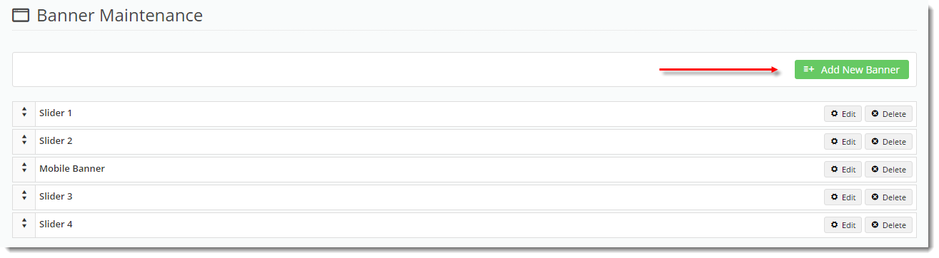
- In the CMS, navigate to Content → Banners.
- Select a Banner Type.
- Click 'Add New Banner'.
- Populate the banner details as required.
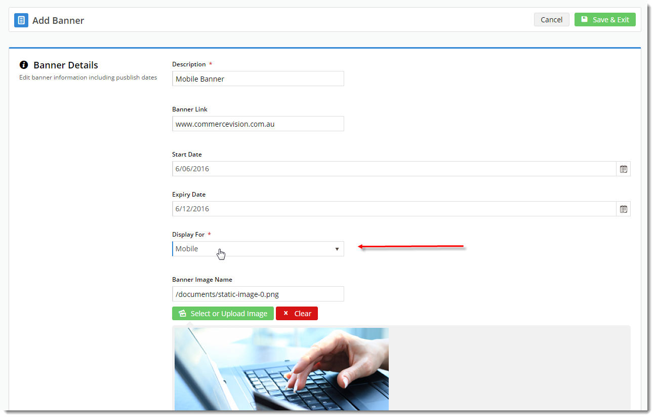
- Set the 'Display For' value:
- All
- Desktop
- Mobile
- Tablet (version 4.02+ only)
- Save & Exit.
Refresh the template cache in order to see the changes on your website.
- In the CMS, navigate to Settings → Dictionary.
- Tick the 'Templates' option and click 'Refresh Cache'.
- A confirmation message will display when complete.
- Refresh your web page using CTRL + F5 - the banner(s) should now display on the appropriate devices.

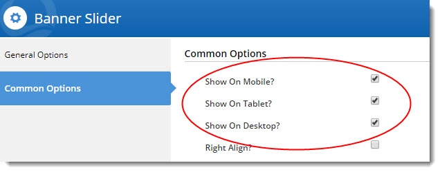
To target an entire Banner Slider widget by device (version 4.02+):
- In the CMS, navigate to the page template your banner slider appears on.
- Edit the Banner Slider.
- Select the Common Options tab.
- Tick the boxes for the devices you wish to display the slider on.
- Save.
- You may need to refresh your template cache in order to see the changes. Refer to the instructions above.
Related articles