Widget Use
Renders the product category menu, in which all categories expand from one top level menu item.
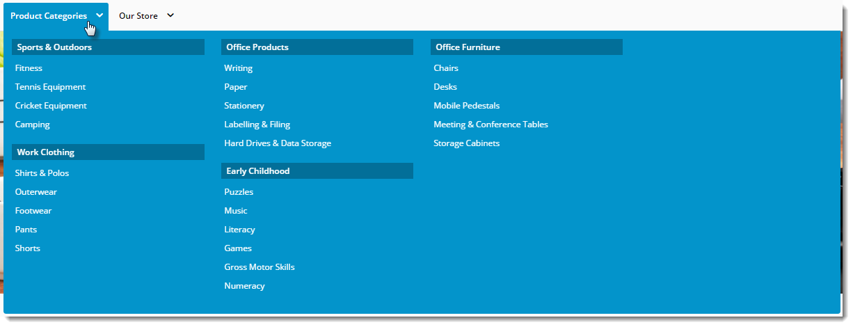
Example of Widget Use
Following is an example of the widget in use:
| Desktop | Mobile |
|---|---|
|
|

Where can the Widget be placed?
The widget can be used in the following templates:
- Theme Layout Template
Widget Options
| Option | Use | Comments | Available from Version |
|---|---|---|---|
| Description | A short description of the widget's use. | We recommended this field be updated so the widget's purpose is clear at a glance from the template page. | All |
| Layer | The layer the widget is valid for. | The layering technology allows for the content to be shown to specific audiences. This is handy if the content is only valid for a certain type of user, or if the same widget is required for more than one audience, but different configuration is needed. The widget can be added to the zone more than once and the layer feature can determine which audience can see each widget. | All |
| Append / Prepend Category Menu? | Determines whether the category menu is inserted at the beginning or end of the site's main menu.
| Default is: Prepend | All |
| Insert Category At Location | This will override the Append / Prepend setting and insert the category menu at this particular location on the menu. | Locations are expressed numerically, so the first menu position would be 00, next 01, third would be 02, and so on. | All |
| Category Menu Levels | The number of category levels to be displayed in the menu. | Default is: 2
| All |
| Max Number Of Columns | The maximum number of category columns to be displayed under the top level menu item. | Default is: 4
| All |
| Product Category Menu Text | The text for the top level category link. | Default is: Product Categories | All |
| Product Category Menu Link | The URL for the page the top category menu item links to. | All | |
| Product Category Menu Icon | The icon displayed to the left of the Product Category Menu text. |
| All |
| Product Category Menu List | A comma-separated list of categories to be displayed in mega menu format, instead of the Product Category Menu text with all categories beneath. | Example: SX04,SX01,SX02 | All |
| Add SEO URL for product category menu? | Default: disabled Tick to enable | ||
| Category URL Prefix | The prefix inserted into the category URL before the category name. Primarily used during existing site upgrades to BPD, where it is desirable to maintain existing URLs. | Example: /category | All |
| Show Single Column for 2 Level Categories? | Determines whether just the upper level category is displayed in cases where the category consists of 2 levels. | Default is: disabled Tick to enable | All |
| Use Manual Column Sequencing? | Determines whether to use manual assignment of categories into columns. When ticked, obeys the sort sequence from Category Maintenance program in PRONTO. Sort sequence 100's will appear in the first column, 200's will appear in the second column, and so forth. | Default is: disabled Tick to enable | All |
| Show Category List Title? | When there are custom templates displayed within the category drop-down, enable this to display a title above the category list. | Default is: disabled Tick to enable | All |
| Render Mode | Determines the style in which the menu is rendered: Drop-down or flyout | 4.01 | |
| Render Custom Sections? | When there are custom templates available for display around a menu section, enable this option to render them. | Default is: disabled Tick to enable | |
| Render Mobile Menu? | Determines whether the navigation menu should be displayed on mobile devices. | If the flyout-style Mobile Menu widget has been added to the Theme Layout, we recommend this setting be unticked so the navigation menu does not render on mobiles. Default is: enabled Untick to disable | All |
| Titles | |||
| Category List Title | The text for the Category List Title. | Default is: Product Categories | All |
| Category List Title Link | The URL for the Category List Tile link. | All | |
| Mobile-only Content | |||
| Login Prompt | The text for the login link on mobile. | Default: Login | All |
| Logout Prompt | The text for the logout link on mobile. | Default: Logout | All |
| Register Prompt | The text for the registration link on mobile. | Default: Register | All |
| My Account Prompt | The text for the dashboard page link. | Default: My Account | All |
| My Account Page | When populated, inserts a mobile menu item linking to a dashboard page for logged in users. | Example: /dashboard | All |
| Login Page | The page the login link redirects to on mobile for public users. | Default: /login | All |
| Register Page | The page the register link redirects to on mobile for public users. | Default: /register | All |
Please note - updating options in this widget will require a Template cache refresh in order for the changes to be visible.
Other Widgets
-
Order Payment Links Form Widget — Renders an order details stepper with an order form that can be automatically populated with query strings, and/or manually entered by the user. The form doesn't validate the order details are accurate in order to stay both secure and accessible to unauthenticated users.
-
Magic Link Authentication Message Widget — Renders the Magic Link authentication message.
-
CUSTOM_Side by Side Content Tiles Widget — Renders two side by side content tiles in a zone with widget options for selecting or adding background colour, image, text and link/button positioning.
-
Stock Dialog Widget — Displays the Stock to Receive Detail dialog window.
-
Stock to Receive Widget — Displays the Stock to Receive page.
-
Stock Levels Widget — Displays Stock Levels page.
-
Order Declined Pending 3rd Party Installment Msg Widget — Renders the message body for the email sent when the user selects to sign up and pay with a Buy Now Pay Later provider but approval is subject to further checks.
-
Order Field Static Widget — Renders an additional order field in email templates.
-
Online Quote Validation Widget — Renders the appropriate message to the user after the current status of an online quote accessed via an email link is validated.
-
Header Level Cost Centre Widget — Renders the cost centre input field on the order header in the shopping cart.
-
Openpay Summary Widget — Renders Openpay marketing information for a product on the product detail page. Use this widget instead of the Product Purchase Details widget if you want to customise tagline placement on the template.
-
Order Line Availability - Click and Collect Widget — Displays product availability and delivery methods at the order line level in dynamic scenarios such as the cart when Click & Collect is enabled.
-
Account Activation Email Content Widget — Renders the message content in the Invitation to Register an Account email.
-
Order Template Cost Centre Widget — Renders the cost centre input field on each product line in an order template.
-
BPAY Account Payment Detail Widget — Renders BPAY payment information in the body of the BPAY Account Payment email. This email is sent to users who pay invoices or pay down their account balance using BPAY.