Widget Use
Shows the children elements of a specific menu item
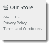
Example of Widget Use
Where can the Widget be placed?
The widget can be used in the following templates:
- Theme Layout (recommended)
- All Templates
Widget Options
| Option | Use | Comments | Available from Version |
|---|---|---|---|
| Description | A short description of the widget's use. | It is recommended to use this so the reason for use of the widget is seem from the template page | All |
| Layer | The layer the widget is valid for. | The layering technology allows for the content to be shown to specific audiences. This is handy if the content is only valid for a certain type of user, or if the same widget is required for more than one audience, but different configuration is needed. The widget can be added to the zone more than once and the layer feature can determine which audience can see each widget. | All |
| Section Menu Item Code | This refers to the Section Menu Item code that is created in the Menu Editor in the CMS. | ||
| List Heading | The heading list is the heading for the Section Menu that will be displayed above the Menu List | This will not display on a feature navigation | |
| Heading Link | This is the URL that the List Heading will link to if clicked | This will allow you to assign a link to the heading, by default this is empty. | |
| Heading Icon | This is the Icon that is displayed next to the List Heading above the Section Menu List | This will add an icon class to the list heading | |
| Heading Icon Position | Determine if the Icon that was picked in the previous option is displayed to the left or right of the List Heading | This allows you to have the icon on the left or right hand side of the heading. It defaults to left if not set and will also be set to left if the section menu is a dropdown menu.
Default is: Left | |
| Show Menu Item Icons? | Determines whether the items in the list with included icons will display the icon next to the Menu Item. | Default is: Unticked Tick to Enable | |
| Menu Icon Position | Determines if the Menu Item Icons are displayed on the left or the right of the Menu Item | This allows you to have the icon on the left or right hand side of the menu items. It defaults to left if not set. Default is: Left | |
| Is Feature Navigation Menu? | If this option is ticked it will display the menu in a vertical layout instead of the default horizontal layout. It is recommended that this this option is only selected if the menu is intended to be a feature navigation menu. | Default is: Unticked Tick to Enable | |
| Is Dropdown Menu? | Enabling this option will make all items in the section menu to be placed into a dropdown menu. If the "Is Feature Navigation Menu?" is ticked, enabling this option will have no effect. | Default is: Unticked Tick to Enable | |
| Show On Mobile? | Determines whether the widget is displayed on a mobile device. If unticked, the HTML snippet will be hidden on mobile devices. | Default is: ticked Untick to disable | |
| Show Only Icon On Mobile? | Determines whether just the icon is displayed on mobile devices. If ticked the prompt text will be hidden on mobile devices. | Default is: ticked Untick to disable | |
| Right Align? | Pushes the widget to the right of the zone it is located in. | Default is: unticked Tick to enable |
Other Widgets
-
Order Payment Links Form Widget — Renders an order details stepper with an order form that can be automatically populated with query strings, and/or manually entered by the user. The form doesn't validate the order details are accurate in order to stay both secure and accessible to unauthenticated users.
-
Magic Link Authentication Message Widget — Renders the Magic Link authentication message.
-
CUSTOM_Side by Side Content Tiles Widget — Renders two side by side content tiles in a zone with widget options for selecting or adding background colour, image, text and link/button positioning.
-
Stock Dialog Widget — Displays the Stock to Receive Detail dialog window.
-
Stock to Receive Widget — Displays the Stock to Receive page.
-
Stock Levels Widget — Displays Stock Levels page.
-
Order Declined Pending 3rd Party Installment Msg Widget — Renders the message body for the email sent when the user selects to sign up and pay with a Buy Now Pay Later provider but approval is subject to further checks.
-
Order Field Static Widget — Renders an additional order field in email templates.
-
Online Quote Validation Widget — Renders the appropriate message to the user after the current status of an online quote accessed via an email link is validated.
-
Header Level Cost Centre Widget — Renders the cost centre input field on the order header in the shopping cart.
-
Openpay Summary Widget — Renders Openpay marketing information for a product on the product detail page. Use this widget instead of the Product Purchase Details widget if you want to customise tagline placement on the template.
-
Order Line Availability - Click and Collect Widget — Displays product availability and delivery methods at the order line level in dynamic scenarios such as the cart when Click & Collect is enabled.
-
Account Activation Email Content Widget — Renders the message content in the Invitation to Register an Account email.
-
Order Template Cost Centre Widget — Renders the cost centre input field on each product line in an order template.
-
BPAY Account Payment Detail Widget — Renders BPAY payment information in the body of the BPAY Account Payment email. This email is sent to users who pay invoices or pay down their account balance using BPAY.