Overview
Features that have image slideshow/carousel contain Carousel Options in the controlling widget. Some widgets that have Carousel Options include:
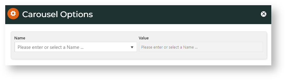
Example

Settings
- Click Edit to set carousel options.
- In Name, select the carousel setting.
- Enter or select the Value. (See: Setting Names & Values)
- Click Add.
- When finished with all settings, click Apply.
Settings Names & Values
Includes all Carousel options provided for plugin video, lazyload, autoheight and animate.
* Commonly set by Commerce Vision customer websites. To use the default for a setting, there is no need to manually add it.
| Name | Values |
|---|---|
| Items* | Number of items (images, products, articles, etc) displayed on the screen at a time. Default: 3 |
| Margin | Right margin (px) for each item. Default: 0 |
| Loop* | Move items in infinite loop? Toggle ON or OFF. Default: OFF |
| Center* | Centre the starting/current item and show partial previous/next item? Works well with odd item number. Default: OFF |
| MouseDrag | Allow dragging with mouse? Default: ON |
| TouchDrag | Allow dragging on touchscreens? Default: ON |
| StagePadding | Add padding in pixels to the stage, making off-stage next/previous item visible ? Default: 0 |
| AutoWidth | Allow variable width for items in the carousel? Default: OFF |
| StartPosition | Item number to start on when page loads. Default: 0 |
| Nav* | Show Next/Previous buttons? Default: OFF |
| Rewind | Slide backwards to previous item direction when last item reached instead of looping to the first slide? Default: ON |
| NavText* | The text for Next/Previous buttons when Nav is ON. Default: 'next','previous' TIP - use HTML to style it to suit your site. |
| NavElement | HTML Default: div |
| SlideBy | Set how slides to move to next. Next one (default of 1) or by two, three, etc? Default: 1 |
| Dots* | Show dots at bottom of banner to indicate navigation? Default: ON |
| DotsEach | (Dots must be ON.) Enter 'True' for a dot to indicate one page in the sequence, or a number for the number of pages a dot represents. Default: False |
| Autoplay* | Set the carousel to move to the next slide automatically. Default: OFF |
| AutoPlay Timeout* | (Autoplay must be ON.) Interval time before carousel starts and between slides, in milliseconds (1 second = 1000 milliseconds). Default: 5000 (= 5 seconds) |
| AutoHoverPause* | Pause when mouse hovers over banner? Default: OFF |
| SmartSpeed | The time it takes for all slide animations to complete. Default: 250 |
| AutoPlaySpeed | (AutoPlay must be ON.) The time (in milliseconds) for AutoPlay slide animation to complete. Default: false |
| NavSpeed | (Nav must be ON.) The time (in milliseconds) for the Next/Previous navigation slide to complete. Default: false |
| DotSpeed | (Dots must be ON.) The time (in milliseconds) for the dot navigation slide animation to complete Default: Number/Boolean |
| DragEndSpeed | The time (in milliseconds) for the animation to complete once you stop dragging the slider left or right. Default: false |
| Callbacks | (Needs Commerce Vision consultation) Listens for specific events and allows advanced/custom JS manipulation of the Carousel. Default: ON |
| Responsive | Object containing responsive options for browser width breakpoints.
Set to 'false' to remove responsive capabilities, e.g., if your layout is non-flexible. Default: empty object |
| Responsive RefreshRate | (Responsive must not be 'false'.) The time to wait after you changed the browser width to perform refresh actions (calculating widths/ cloning items etc.) Default: 200 |
| Video | Allow a video to be embedded to play in the banner Default: OFF |
| VideoHeight | (Video must be ON.) Set embedded video height. Default: OFF |
| VideoWidth | (Video must be ON.) Set embedded video width. Default: OFF |
| AnimateOut | Animation effect type when item leaves user's view. Select value from dropdown list. |
| AnimateIn | Animation effect type when item enters user's view. Select value from dropdown list. |
| ItemElement | The HTML container type for each individual item. Default: div |
| StageElement | The HTML container type for the entire area with the carousel. Default: div |
| NavContainer | Have Nav in custom HTML container? Default: false |
| DotsContainer | Creat a custom container for Dots using HTML, class, ID Default: OFF |
| LazyLoad | Load items only they are viewable on screen. For better page load speed. Default: ON |
| LazyLoadEager | Preload images to the right (and left when Loop is enabled) based on how many items specified. Default: 0 |
Related help