Widget Use
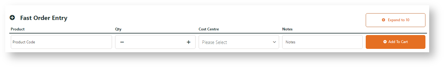
Adds input lines to the cart page so users can add products directly to the order. The user can enter product codes and quantities, or use a search tool.Example of Widget Use
Where can the Widget be placed?
The widget can be used in the following templates:
- Cart Template
Widget Options
| Option | Use | Comments | From Version |
|---|---|---|---|
| Description | A short description of the widget's use. | This description is added to the widget title. It makes the widget's use clear on the template page. | All |
| Layer | The layer the widget is valid for. | Use layering to limit widget content to certain groups of users. To use the same widget for more than one user group but with different options set, add the widget as many times as needed in the same zone. Then add layering to define the user group each time. | All |
| Number Of Lines | Number of order entry lines displayed. | Default: 1 | All |
| Number Of Lines Use User Preferences? | Overrides the 'Number of Lines' widget setting with the user's preference (set in User Preferences). | Default: OFF Toggle to enable | All |
| Use Predictive Search? | Enables predictive search via Lucene in the Product Code input box. | Default: OFF Toggle to enable NOTE - When ON and the list displays one or more products, the user can press Enter to select the first product in the list. The product will not be added to cart until they press Enter again. | All |
| Show Product Image? | Determines whether the image is included in the product search suggestions dropdown. | Default: OFF Toggle to enable | 3.89 |
| Show Product Code? | Determines whether the product code is included in the product search suggestions dropdown. | Default: ON Toggle to disable | 3.89 |
| Show APN Instead Of Product Code | Displays the product's APN instead of product code in search results. | Default: OFF Toggle to enable | All |
| Placeholder Image | Placeholder image when thumbnail product image not available. | ||
| Is For Warranty Claim Service Products? | Default: OFF Toggle to enable | ||
| Show Tool Tip? | Determines whether a help icon is displayed, which launches tooltip text on hover. | Default: OFF Toggle to enable | 3.86 |
| Show Note Field? | Whether to include the Note field for user to enter comments | Default: OFF Toggle to enable | 3.96 |
| Increase Quantities In Pack Qty? | Whether number to add to cart will increase/decrease in pack quantity for a product sold in pack quantity | Default: OFF Toggle to enable | |
| Collapsible Area Expanded By Default? | Whether the default is to show the expanded number of additional order entry lines or the collapsed view. | Default: OFF Toggle to enable | 3.86 |
| Show Add All Button? | Includes a button to add multiple products to the cart. ON: button will only appear when the number of lines is > 1. | Default: OFF Toggle to enable | All |
| Show Expand/Collapse Button? | Whether a toggle button is rendered, allowing the user to expand or collapse the additional order entry lines. ON: button will only appear when the number of lines is > 1. | Default: OFF Toggle to enable | 3.86 |
| Exclude Order Restricted Products | Where Order Restrictions are in use on the site, this flag will prevent restricted products from showing up in the Fast Order Entry lookup. | Default: OFF Toggle to enable | 4.06 |
| Titles | |||
| Heading | The text displayed at the top of the widget. | Default: Fast Order Entry | All |
| Heading Icon | The icon displayed to the left of the heading text. | Select via drop-down | All |
| Notifications | |||
| Product Added Message | The text displayed when a single product is successfully added to cart. | Default: Your product has been successfully added | All |
| Products Added Message | The text displayed when multiple products are successfully added to cart. | Default: These products have been successfully added: | All |
| Add All Error Message Format | Use placeholders {0} for product code and {1} for error message | Default: {0} : {1} | All |
| Buttons | |||
| Add Button Label | Text displayed on the 'Add To Cart' button. | Default: Add To Cart | All |
| Add All Button Label | Text displayed on the 'Add All To Cart' button. | Default: Add All To Cart | All |
| Expand/Collapse Button Label (Expanded) | Text displayed on the expand/collapse toggle button when all lines are expanded. Use placeholder {0} for the total number of lines. | Default: Expand to {0} | 3.86 |
| Expand/Collapse Button Label (Collapsed) | Text displayed on the expand/collapse toggle button when additional lines are collapsed. | Default: Collapse to 1 | 3.86 |
| Prompts | |||
| Code Placeholder Text | Placeholder text displayed in the Product Code input box. | Default: Product Code | All |
| Price Heading and Placeholder Text | Default: Price | ||
| Cost Centre Heading and Placeholder Text | Placeholder text displayed in the Cost Centre input box. | Default: Cost Centre | 3.88 |
| Extended Attributes Heading and Placeholder Text | Default: Extended Attributes | ||
| Notes Heading and Placeholder Text | Placeholder text displayed in the Note input box. | Default: Notes | 3.88 |
| Tooltips | |||
| Fast Order Entry Tool Tip | Text displayed when the user hovers over the help icon. | 3.86 | |
Related help