Overview
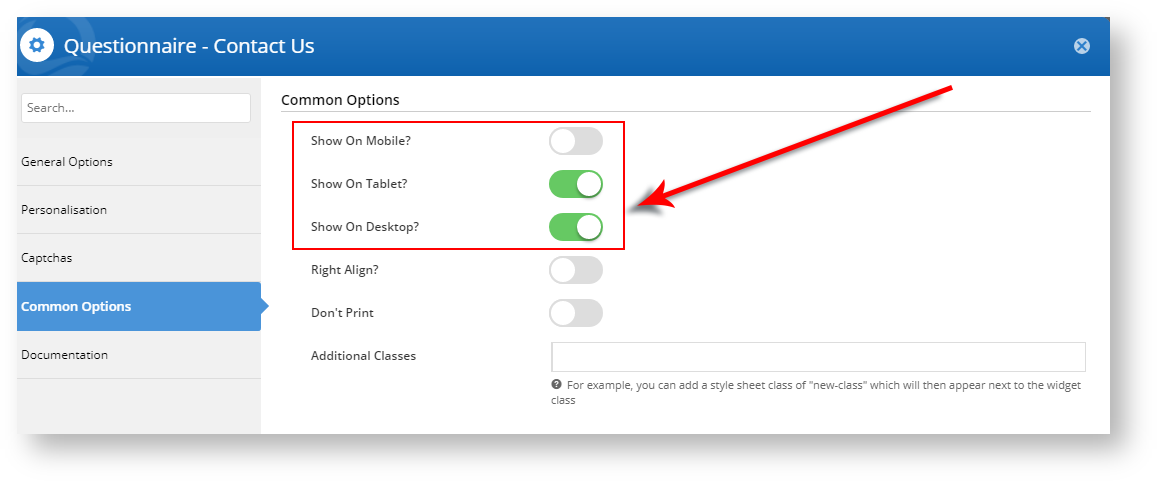
From version 4.15.00 onward, we have enhanced the "Show on Mobile?", "Show on Tablet?", and "Show on Desktop?" widget display options. When you toggle one or more of the "Show On" device type displays to OFF, the icons will display on the widget in the template page to indicate what devices will display (or not) that widget's content.
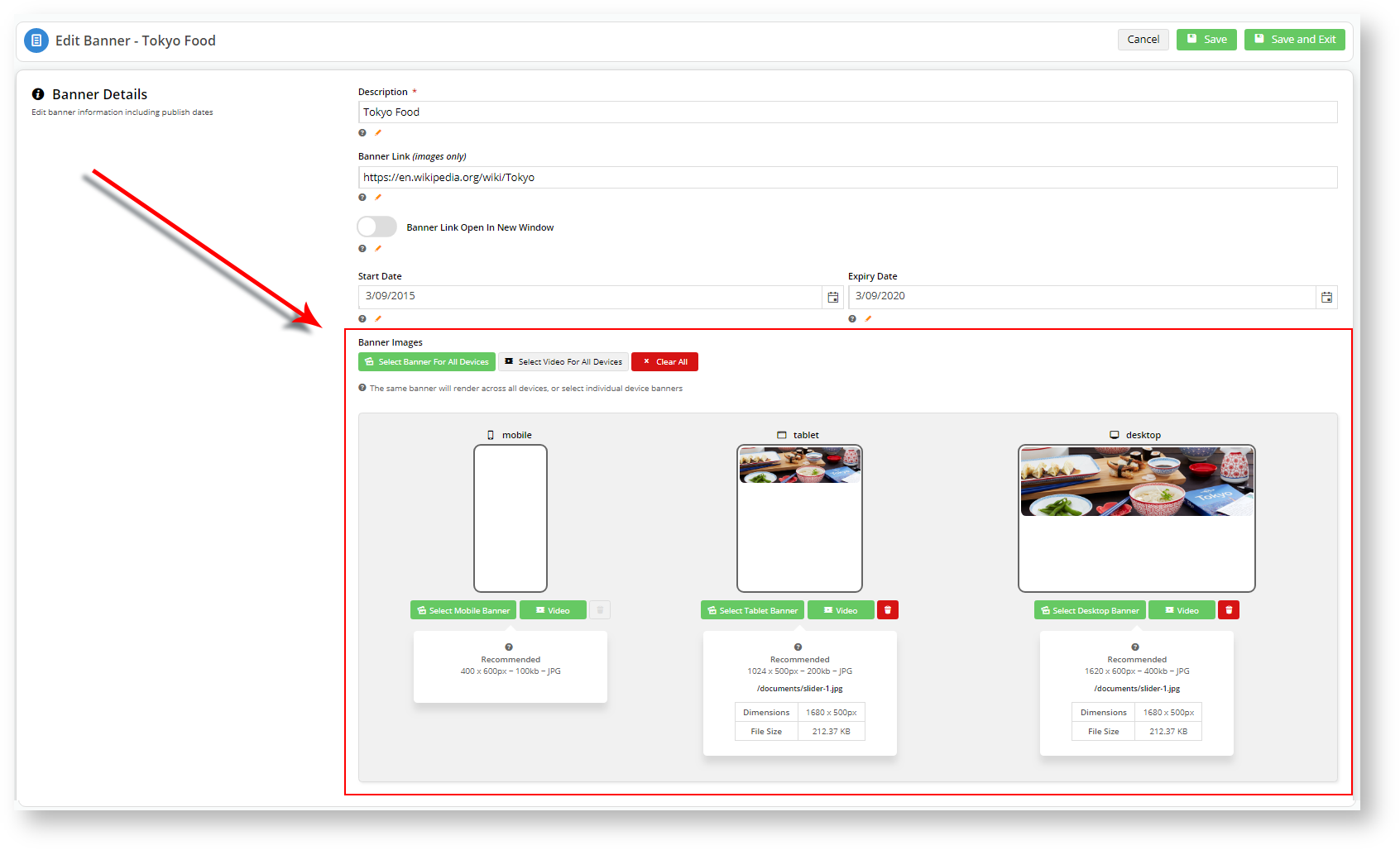
In the case of Banner sliders, we realise that you may not want the same image to display on all device types, or even at all. Perhaps an image doesn't render well on mobile devices. Therefore, you can find the same Desktop, Mobile, and Tablet display options in each individual banner file in Banner Maintenance, updated to show you how the image will appear on the relevant device.Change to Banner Sliders
The individual Banner Details: Banner Images settings takes precedence over the Show on <device>? switch in the Banner Slider widget.
For instance, in the above screenshot, you have specified that mobile devices won't display the "Tokyo Food" banner.
If you toggle Show on <device>? to ON for all device types in the Banner Slider widget, the "Tokyo Food" banner image will still not show up on mobile devices.
Banner Details: Banner Images settings override the Banner Slider widget settings.
Additional Information
The new device display toggle options will appear for sites running version 4.15 and above.
Refer to the Widget Device Display Indication: Mobile, Tablet, and Desktop knowledge base article for more information.
| Minimum Version Requirements |
|
|---|---|
| Prerequisites |
|
| Self Configurable |
|
| Business Function |
|
| BPD Only? |
|
| B2B/B2C/Both |
|
| Third Party Costs |
|
Related help


