Your business design and branding guides supplied to Commerce Vision have been incorporated into the theme creation process.
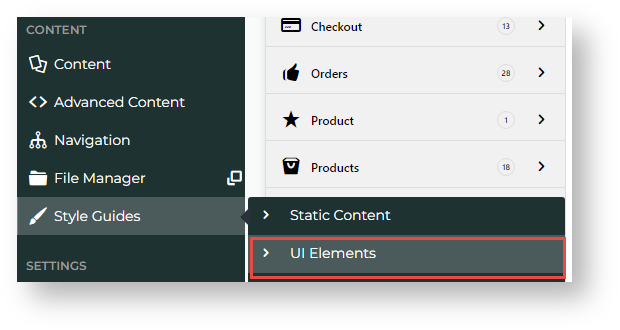
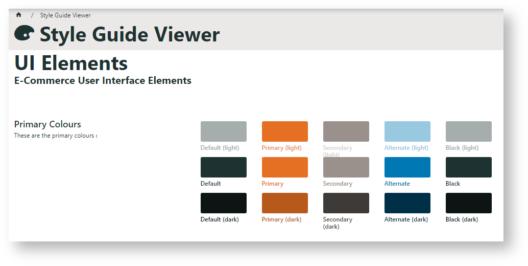
Colours for basic elements on your site are displayed under UI Elements on the Style Guides menu in CMS.
These colours are incorporated throughout widget options (where applicable) and the static content widget. They can also be applied to:
- 'additional classes' in HTML Snippets and Custom Widgets
- standard widgets to basic effect. (Note - results may vary).
See: Design UI/UX - Additional Classes "Utility Classes
Classes and effects:
Classes to Apply | Effect |
|---|---|
default background | background colour shading |
default text | text colour |
primary background | background colour shading |
primary text | text colour |
secondary background | background colour shading |
secondary text | text colour |
alternate background | background colour shading |
alternate text | text colour |
black background | background colour shading |
black text | text colour |
Related help


